Digital art design, renderings, signatures and anything art related. Upload pictures of your newest work or ask for feedback. Post graphics requests or discuss art in general.
Took your advice broken, worked on my light source, used a lens flare. Dodge and burned her face. First time using clipping masks. A lot of smudging, and a c4d thrown in there. Tried a new border. Lot's of gradients, tried to keep the simplicity vibe yet at the same time random and curious.
I was going for "soft." It looks like she's wondering something, thinking. So I wanted the text to be really simple and soft to correlate with that. Yeah I sharpened it, I guess I could have done it once more, but it looked a little "over" sharpened with I did it again. Anyways thanks for the comments as always <3
I love it. Personally, I think it's your best one before.
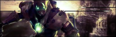
First of all, I absolutely love the use of colors. The bright colors on the right and the more basic brown on the left create a real feeling of serenity, hence the name of the Sig.
Also love the render. First perfectly in with the mood you were going for.
The only thing that I SLIGHTLY don't like is the guy's hood on the very left. It's starting to blur a bit, and for some reason, contrasted with the very solid right side of the render (his face), it looks slightly strange. Like he was smeared a bit.
Still, I absolutely love the Sig. Nothing much else to say. 10/10 from me!
Thanks fena! <3 you. Anyways yeah I smudged quite a bit on the hood tried to get the feeling like it was being pulled away so it would go with the brushing and clipping masks. I see what you mean though. It was just the style I was going for, I could have made the smearing a bit more gradual. Anyways thanks for the comments as always guys <3