Digital art design, renderings, signatures and anything art related. Upload pictures of your newest work or ask for feedback. Post graphics requests or discuss art in general.
hey tell me what ya think. i tried to go with the new ideas that i have, and that you here have helped me with .. please give me the helpful advice that you did before.
i do like the lighter side of things tho, kinda have a few more options on working with it ^^
thanks.
- 67 pure int spear nuker - xian - Death_2_ALL - gld ldr insane rage - 4 - 420 union -
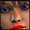
The render seems a little small to me, as well as a little blurry. Brushing seems too random and doesn't really seem to flow with the BG or the sig itself. Try more brusing around the render and getting it to flow. Don't like the text. Try something not so big? and placement is always key. Also noticed there is no border on it. Work with the colors of the render. Try using some browns in your brushing to go with your render <3
It just gives it a final touch. I guess it's all personal preference whether or not you want one or not. Generally though most sigs have a border of some sort.
yea the border is a bit off, and croses through her kneck ... lol i tried something different with the text, added a white dot on her head to try and bring out a little light on her, and added more brush brown for the bg.
- 67 pure int spear nuker - xian - Death_2_ALL - gld ldr insane rage - 4 - 420 union -
you should work with contrast some more, with light and dark areas. what i've
seen now is that your first sigs were dark and this sig is light. if you could get
some kind of lighting in there, you will create more depth in the sigs too, which
will make em look less plain.
for starters, you could try out the basic lighting effects in photoshop a bit.
thats Filter -> Render -> Lighting effects... i think.
durkadurka wrote:did i do any better or get worse?
yea the border is a bit off, and croses through her kneck ... lol i tried something different with the text, added a white dot on her head to try and bring out a little light on her, and added more brush brown for the bg.
Well...thats one way of doing it I suppose. Try making a new layer (ctrl+shift+N) and put that layer above the others. Push ctrl+A (You should see little lines flashing around the edge of the entire sig) then go to Edit-->Stroke--> and choose a color and select a px size that you like the most. If you look at my sigs I use a 2px border. Just a reference.
yea, im real new with the lighting effects. and to be honest i dont quite understand it completely yet.
the contrast between light and dark in the same sig is something else imma have to play with. i figured they were either light or dark not both =P ... by the way ... noob here, what does imo mean ?
----
dam thats how you make boreders LOLOLOL ... i was making a small bow across the entire pic, then copy and drag it to the bottom...
who wouldve thunk making a sig was so complicated lmao
but with that, one day imma hook it up and you all that has giving me advice will be able to smile knowing you all had a huge part in it ^^
thanks in advance
- 67 pure int spear nuker - xian - Death_2_ALL - gld ldr insane rage - 4 - 420 union -
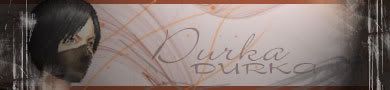
current is way better. bg and render of current go well together.
and btw, most of the times, its best to start all over if you're making a sig in
a completely different way. like this one, its not made to have that lighting
effect.
like i did in the last attempt right? i tried to put the spot light on the middle which left the sides dark... but it still didnt fit right lol ...
side question. whats the difference between the lighting effect and the lens flare, or do they pretty much do the same thing. all i can tell is that the lens flare puts a light specifically on one spot where as the lighting effect is more the entire thing not just one spot.
- 67 pure int spear nuker - xian - Death_2_ALL - gld ldr insane rage - 4 - 420 union -