
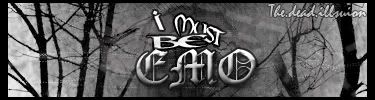
Rate it please, I don't really like it myself, but who knows maybe you do..


Rizla wrote:I hate popouts. Widening a focal point outside the flow of a piece is never a good idea. When doing a popout the only thing that should pop out are things other than your focal. I think the background is o.k., but dont fit your focal at all. Text is ick imo, first priority with text is readiability, when you skew it or type it along a wavy path you lose alot of it. 4/10.
Nice selection on your render though, if you did it.


