Digital art design, renderings, signatures and anything art related. Upload pictures of your newest work or ask for feedback. Post graphics requests or discuss art in general.
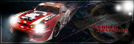
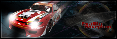
O think you could easily gain a more symbiotic feel by grabbing the shapes in the background and make a clipping mask off the car. I think the text should be as bright and vivid as the car, the car looks good, I like how it reacts with the border from the headlights, but the motion blur/smudge in the back shouldnt affect the border imo -- that makes it seem like the whole car is above your border.
ok so here it is ...i LOVE it but i do think that the border shouldnt be affected^^stated above^^ and is the white triangle in the windshield sposed to be there???
The car is great with how u makeit look like its moving but like other people said the background is a little plain, mayb add some colour to it and fix some lighting
you mean shift the car right and rotate it to follow the road you outlined? lol i actually moved the car more left because i didn't want it to be so centered. just a different perspective i guess. thanks for the comments guys :)