Digital art design, renderings, signatures and anything art related. Upload pictures of your newest work or ask for feedback. Post graphics requests or discuss art in general.
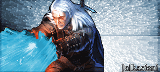
7/10, the render, somehow it doesnt seem like it fits in the background you know what i mean? It looks like it doesnt belong there, and the colours dont match too imo, but i like that background a lot. Still good job
8/10 now i like it, i just think the text could/should be seen easier, it's kinda hard to see it. otherwise, it woulda been 9/10 cause it's pretty good imo
background too chaotic lighting is coming from everywhere
try in photoshop: first -> hide the layer(s) of the snake guy make a new layer on top of the other layers go image -> apply image now go filter -> render -> lighting effects, and make the lighting come from like top left. then unhide the snake guy layer, put it on top, go filter -> render -> lighting effects again, and make the lighting on the snake guy like it fits with the background layer.
idk how much a photoshop pro you are atm, but the above tip just might bring some less chaos to the sig >.<