NSR Waves'01

Digital art design, renderings, signatures and anything art related. Upload pictures of your newest work or ask for feedback. Post graphics requests or discuss art in general.
Post Reply
Snudge
Senior Member
Posts: 4200
Joined: Sun Jun 11, 2006 8:20 pm
Quick Reply: Yes
Location: Artist Corner
Contact:

NSR Waves'01

Post by Snudge »

                      Image
                            C'nC?
<<banned from SRF for proof of botting. -SG>>

User avatar
Millenium
Ex-Staff
Posts: 2732
Joined: Tue Oct 24, 2006 6:36 pm
Quick Reply: Yes
Location: Waterloo
Contact:

Re: NSR Waves'01

Post by Millenium »

I'll keep it short this time.

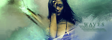
I have a mixed feeling about this. The smudging and the effects, coloring is amazing as usual, so is the text. Whats bothering me is the effects on her boobs. Like, I'm telling you right now >.> that there shouldn't be any effects, EVER, over boobs. It destroy's the beauty of the stock and make it look unrealistic.

I also don't like how your gradient maps and adjustment layers messed up her skin tone. She looks like a ghost underwater right now. Perhaps you inteded to look that way but I have to go against it.

I really like how you smudged her shoulder to the left, but since the title was Waves maybe I expected something with bit more curves rather than hard straight lines.

That's about it hun! Lovely work <3
DID YOU KNOW? Milly has retired!!!!


Status: Into Minecraft

ImageImage

User avatar
_Angels
Active Member
Posts: 707
Joined: Fri Nov 23, 2007 8:35 am
Quick Reply: Yes
Location: Artist corner

Re: NSR Waves'01

Post by _Angels »

i like it her face and eyes llook ebil like that woman out of the ring and grudge =o
<< banned on request. -cin >>

User avatar
HOLLAstir
Loyal Member
Posts: 1637
Joined: Tue Aug 28, 2007 7:17 pm
Quick Reply: Yes
Location: 206
Contact:

Re: NSR Waves'01

Post by HOLLAstir »

Ironicly the only thing I really like is the text. Generally I'm not a fan of the `08 and tiny text but it fits fairly well. Anways, the smudging coming off of her shoulder doesn't really fit. Everything in the tag is just soft smudging and then you see a hard streak. Her skin complection is really dark, she kinda looks dead. Considering her bikini top is blue, I don't think green was the best choice of color. No light source either. I like the smudging around the corners, definately one of your fortes. I think the "wave" effect you were going for didn't turn out the best. Sorry for not a lot of positive feed back, but i'm not really feeling this one.
Image

Image

Snudge
Senior Member
Posts: 4200
Joined: Sun Jun 11, 2006 8:20 pm
Quick Reply: Yes
Location: Artist Corner
Contact:

Re: NSR Waves'01

Post by Snudge »

Blue bikini?
Awesome!


It's black.
<<banned from SRF for proof of botting. -SG>>

User avatar
HOLLAstir
Loyal Member
Posts: 1637
Joined: Tue Aug 28, 2007 7:17 pm
Quick Reply: Yes
Location: 206
Contact:

Re: NSR Waves'01

Post by HOLLAstir »

Snudge wrote:Blue bikini?
Awesome!


It's black.


Just noticed, The smudging and effects you did around it changed it to a blueish color. Anyways, green still wasn't the best choice.
Image

Image

Snudge
Senior Member
Posts: 4200
Joined: Sun Jun 11, 2006 8:20 pm
Quick Reply: Yes
Location: Artist Corner
Contact:

Re: NSR Waves'01

Post by Snudge »

Also, I know the effects on her arm look weird, they should've been further up, towards her shoulder which kinda pointed out. Which is why I wanted to go for that effect. ;)
<<banned from SRF for proof of botting. -SG>>

Post Reply

Return to “Artists Corner”