NSR 08 Vday Rikku (Another one today)

Digital art design, renderings, signatures and anything art related. Upload pictures of your newest work or ask for feedback. Post graphics requests or discuss art in general.
Post Reply
User avatar
Millenium
Ex-Staff
Posts: 2732
Joined: Tue Oct 24, 2006 6:36 pm
Quick Reply: Yes
Location: Waterloo
Contact:

NSR 08 Vday Rikku (Another one today)

Post by Millenium »

Well its Rikku.
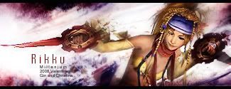
Why Rikku for Valentines? Can't really explain. There is a reason though
I had the render for so long before I had in mind what I wanted it to look like.
No additional stocks or C4Ds used. The color choices were hard but it worked out in the end.
For some reason I'm having an adrenaline rush for sigs today...and my calc midterm is tmr..
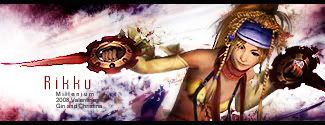
Image

v2
Image

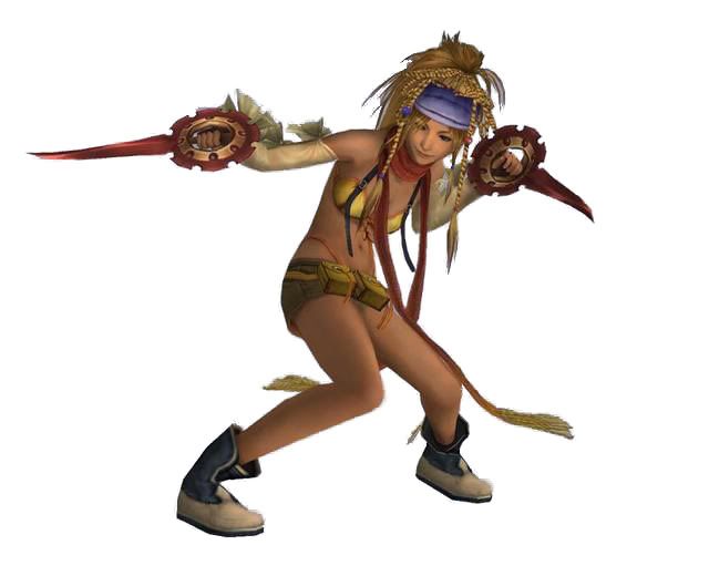
Original: http://i187.photobucket.com/albums/x5/m ... p-ff-9.jpg
DID YOU KNOW? Milly has retired!!!!


Status: Into Minecraft

ImageImage

User avatar
HOLLAstir
Loyal Member
Posts: 1637
Joined: Tue Aug 28, 2007 7:17 pm
Quick Reply: Yes
Location: 206
Contact:

Re: NSR 08 Vday Rikku (Another one today)

Post by HOLLAstir »

BG looks nice. But the render just doesn't seem to fit with it. The render pops out a bit too much for me, could use some more blending in. It just doesn't look quite "right." I do like the bg though. Good luck on your midterm tomorrow.
Image

Image

User avatar
Millenium
Ex-Staff
Posts: 2732
Joined: Tue Oct 24, 2006 6:36 pm
Quick Reply: Yes
Location: Waterloo
Contact:

Re: NSR 08 Vday Rikku (Another one today)

Post by Millenium »

Mooore blending. Moooooore blending. Argh.

Well now that you've mentioned it it does look too popped out. And its probably because of the shadow on the right side of her belly. I'll see how I can get rid of that and blend more in.
DID YOU KNOW? Milly has retired!!!!


Status: Into Minecraft

ImageImage

User avatar
Millenium
Ex-Staff
Posts: 2732
Joined: Tue Oct 24, 2006 6:36 pm
Quick Reply: Yes
Location: Waterloo
Contact:

Re: NSR 08 Vday Rikku (Another one today)

Post by Millenium »

Image

I added a bit more motion blur and urased a lot of parts. I didn't want to smudge my beautiful Rikku so she looks twisted in a weird way. I hope this looks a bit more blended in.
DID YOU KNOW? Milly has retired!!!!


Status: Into Minecraft

ImageImage

User avatar
Hostage
Veteran Member
Posts: 3119
Joined: Thu Jan 25, 2007 8:34 pm
Quick Reply: Yes
Location: Canada,On

Re: NSR 08 Vday Rikku (Another one today)

Post by Hostage »

I really like this one, Mill. I just think the text spacing is just a little to far apart for " Rikku" because the font is to thin itself but that's just me. It looks wonderful especially the bg. Good job ^^8/10

User avatar
Millenium
Ex-Staff
Posts: 2732
Joined: Tue Oct 24, 2006 6:36 pm
Quick Reply: Yes
Location: Waterloo
Contact:

Re: NSR 08 Vday Rikku (Another one today)

Post by Millenium »

Hostage wrote:I really like this one, Mill. I just think the text spacing is just a little to far apart for " Rikku" because the font is to thin itself but that's just me. It looks wonderful especially the bg. Good job ^^8/10


Aw coming from you its such a wonderful compliment and it makes me happy ^^ I haven't forgot how my jaws literally dropped when I saw that music sig wars sig by you. It was like :shock: but much bigger :P

Anyhow, the spacing is big I agree. I tried fatter fonts but i didn't look good. I tried putting Rikku without any spacings and it looked cluttered, so I ended up wth this. I actually like how its spaced out because I think it retains a good balance with the sig and the small text underneath. "Rikku" just looked too short and clumsy in there.
DID YOU KNOW? Milly has retired!!!!


Status: Into Minecraft

ImageImage

User avatar
Hostage
Veteran Member
Posts: 3119
Joined: Thu Jan 25, 2007 8:34 pm
Quick Reply: Yes
Location: Canada,On

Re: NSR 08 Vday Rikku (Another one today)

Post by Hostage »

:oops: you're making me blush. Thank you very much I've yet to top that sig but I'm hoping the new on I'm working on does.=P

....and I think I see what you mean about the text. Well never the less I still think it awesome. =)

Post Reply

Return to “Artists Corner”