Digital art design, renderings, signatures and anything art related. Upload pictures of your newest work or ask for feedback. Post graphics requests or discuss art in general.
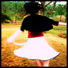
Its HOT ^^ Its hot red and I love it! Its smexy, playful, great stock to work with so I'd like to give it a 7/10. Well 10 - 3 because there are 3 things that I think if you fix it will make the sig look so much more alive.
1. The text could use some different fonts/coor combinations 2. More depth, so sharpeing, blurring, dodging burning or simple add more contrast 3. I would personally like to see some shapes not smudged blur on top & bottom of the girls
6/10 personally i would have made the picture a bit more sharp and defined and would not have made it so foggy around all of the girls, but its all up to how you would like it to be