Digital art design, renderings, signatures and anything art related. Upload pictures of your newest work or ask for feedback. Post graphics requests or discuss art in general.
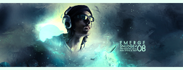
Yeah, that stock has been whored lately. The outcome looks really similar to a tut I saw recently on planetrenders. There are a few tiny things here and there I'd touch on, but they aren't of great importance, like dodging and burning his face a little more. Simple, yet not. I like it.
I like the color, the smudging and the depth your background has! Amazing job!
The only thing that made me go "huh?" Is the how the left side is REALLY bright and there's a mono-colored "dot" to the left side of him. I think that part is destroying the sig. >.>
.rek wrote:I think the text would have been better closer to his face, but besides that great sig.
+1
Perhaps near his face.
I was thinking just a little left. Where his shoulder should be. He might have to switch to a darker tones colour for that though. Nice tag over all though I love it except for that blue elephant looking think over on his right side. Is it just me or does anyone else see it.