Digital art design, renderings, signatures and anything art related. Upload pictures of your newest work or ask for feedback. Post graphics requests or discuss art in general.
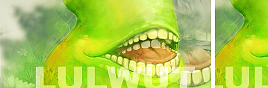
Your flow isn't very established. You have the flow going from the bottom to the top left. Then from the bottom left to the top right. Really contradicts themselves, try to establish a constant flow.
The white outline around the right side of the render (left looking straight on) is a little too much. Keep your text away from the corners, it looks to distant where it's at. Bring it closer to your render.
I see you tried to do some clipping masks, looks alright, i'd make your circles a tad smaller.
Do a solid border, the one your rockin isn't floatin my boat. You're definately improving and getting much better. Keep up the good work.