2 new "noob" sigs, comment a rate

Digital art design, renderings, signatures and anything art related. Upload pictures of your newest work or ask for feedback. Post graphics requests or discuss art in general.
Post Reply
User avatar
Flightmeck
Common Member
Posts: 198
Joined: Thu Sep 06, 2007 9:16 pm
Quick Reply: Yes
Location: East coast (in Sweden)

2 new "noob" sigs, comment a rate

Post by Flightmeck »

Hey all

So i spent the holliday with my grandparents and scense the don't have internet i was getting quite boored after a couple of days. Therefor i tried to be a little creative and made theese two signs.

This was the first one, well not much to say about it, i like planes and i am studdying to become a flight technician so basically my whole existence circles around planes.

Image

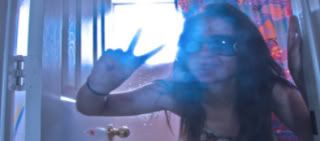
The second one, i like this very much my self, and yeah i was listening to some calm musik when i made it ^^ Thinking of the girl i once loved when i made it ^^

Image

Very well, pleace comment and rate them, sorry if a used a little sloppy language and spelling but im in a hurry, got to eat ;)

Edit:

So i tried to change the text but i don't know if it's any better...
Image

I allso tried to create a little less bright lensflare...
Image

The stocks for the first sig (might be better if i linked to them, if so, tell me):

Image

Image

Image
Last edited by Flightmeck on Wed Jan 02, 2008 8:39 pm, edited 4 times in total.
Image

Quit

User avatar
pineapples
Common Member
Posts: 108
Joined: Fri Oct 27, 2006 3:23 am
Quick Reply: Yes
Location: Jon's tummy.

Post by pineapples »

There's nothing noob about your first Signature. In fact, in my eyes, it looks wonderful. I think it has a fantastic focal point, not to mention the isolated yellow looks great with the grayscale background. The only thing I would change about it is the text. I think the font is fine, but to be honest, the position of it is slightly bugging me. However, still, it's a fine Sig. 8/10 on that one.

I think the second one looks nice as well; not as nice as your first one, however. It's not too much to my style, so I'll decline to comment on it. Just one thing, though - I think that the Lens Flare you used to create the focal point is a little too bright. Maybe tone it down a little?

Overall, nice Sigs. Welcome to the AC! :]
Image


I'M PEACEFUL


+ I borrowed this account from the old pineapples.
shhhhhh!

User avatar
Faiien
Active Member
Posts: 889
Joined: Sun Oct 28, 2007 5:10 pm
Quick Reply: Yes
Location: Artist Corner

Post by Faiien »

This was the first one, well not much to say about it, i like planes and i studdying to become a flightteknichan (spelling?) so basicly my whole existence cirkles around planes.

This was the first one, well not much to say about it, i like planes and i am studying to become a flight technician. So basically my whole existence circles around planes.

spell check just4u :)

nice sigs, let me see the stock for the plane one and ill give you a rating
but atm ill give it a 7/10 :)

second sig 5/10
Last edited by Faiien on Wed Jan 02, 2008 7:47 pm, edited 1 time in total.

cin

Post by cin »

agreed with fena.

sig 1 > sig 2.

all i'd change in sig 1 is the txt. rest looks good as it is.

agreed with what fena said about the 2nd too, the lens flare is a tad too bright.

all and all, sig 1 gets a 8.5/10 from me. sig 2 gets a 7/10

Waisha
Veteran Member
Posts: 3216
Joined: Sat Apr 01, 2006 8:01 am
Quick Reply: Yes
Location: wat

Post by Waisha »

Sig one is sex.

User avatar
Flightmeck
Common Member
Posts: 198
Joined: Thu Sep 06, 2007 9:16 pm
Quick Reply: Yes
Location: East coast (in Sweden)

Post by Flightmeck »

Faiien wrote:
This was the first one, well not much to say about it, i like planes and i studdying to become a flightteknichan (spelling?) so basicly my whole existence cirkles around planes.

This was the first one, well not much to say about it, i like planes and i am studying to become a flight technician. So basically my whole existence circles around planes.

spell check just4u :)

nice sigs, let me see the stock for the plane one and ill give you a rating
but atm ill give it a 7/10 :)

second sig 5/10


hehe thanks for the help with the spelling ^^

You where saying "let me see the stock for the plane one", uhm... im new to this so i don't really get what "the stock" is :oops: , is it the pictures i have used to make this one (there are 3) before i have done anything to them? :) Or is it the whole sig just without the "effects"? :P

About the lens flare and the text, i'll see what i can do ^^
Image

Quit

cin

Post by cin »

stock is the pic / pics u used for the sig yes :]

User avatar
Flightmeck
Common Member
Posts: 198
Joined: Thu Sep 06, 2007 9:16 pm
Quick Reply: Yes
Location: East coast (in Sweden)

Post by Flightmeck »

Oh ok, i'm going to update in a min, if everything goes as planned i can try to upload the stocks to ^^

Edit, Updated :D
Image

Quit

User avatar
0l3n
Elite Member
Posts: 5184
Joined: Fri Jun 16, 2006 1:45 pm
Quick Reply: Yes
Location: Artists Corner

Post by 0l3n »

Not bad but the first one is way to blured and text needs work on both.
Image
Image

cin

Post by cin »

imo, the blurry is smex cause brings the focal plane more to the front.

User avatar
Faiien
Active Member
Posts: 889
Joined: Sun Oct 28, 2007 5:10 pm
Quick Reply: Yes
Location: Artist Corner

Post by Faiien »

i like the blurring in the background but it would have been better if you eased it off the planes a little so it would create 3 separate layers for your sig

User avatar
Flightmeck
Common Member
Posts: 198
Joined: Thu Sep 06, 2007 9:16 pm
Quick Reply: Yes
Location: East coast (in Sweden)

Post by Flightmeck »

0l3n wrote:Not bad but the first one is way to blured and text needs work on both.


cin wrote:imo, the blurry is smex cause brings the focal plane more to the front.


I think i'll let the blurr be, becauls as cin sais i think it brings some of the focal, it can be hard to sharpen it without destroying the focus... Or is it a way to do that?

The text will be as it is for a while, i don't have the energy to do anything about it taday anyway, maybe tomorrow ^^
Image

Quit

User avatar
0l3n
Elite Member
Posts: 5184
Joined: Fri Jun 16, 2006 1:45 pm
Quick Reply: Yes
Location: Artists Corner

Post by 0l3n »

I get why you blured it but I think you blured to much of the sig thats all. 90% of the sig is blured and that makes it look empty.
Image
Image

User avatar
HOLLAstir
Loyal Member
Posts: 1637
Joined: Tue Aug 28, 2007 7:17 pm
Quick Reply: Yes
Location: 206
Contact:

Post by HOLLAstir »

I agree with cin. I like how it's blurred. Makes the focal stronger. It's a simple sig, but I like it. But def change the text on it. Second one doesn't really tickle me fancy.
Image

Image

Luoma
Veteran Member
Posts: 3895
Joined: Thu Sep 14, 2006 8:23 am
Quick Reply: Yes
Location: Artists Corner & Aege

Post by Luoma »

I like what you made from those stocks.
Only thing is what everyone else also is saying, the text needs a little work.
Otherwise thats a really nice looking sig :D

Only talking about the first now.
<<banned from SRF for proof of botting. -SG>>

User avatar
BrokenSaint
Veteran Member
Posts: 3473
Joined: Sun Jan 01, 2006 8:49 pm
Quick Reply: Yes
Location: Stuntin'.
Contact:

Post by BrokenSaint »

Lose the lens flare.

User avatar
Flightmeck
Common Member
Posts: 198
Joined: Thu Sep 06, 2007 9:16 pm
Quick Reply: Yes
Location: East coast (in Sweden)

Post by Flightmeck »

Yeah okey, i get it - you don't like the text and you don't like the second ^^ Thank you for the replys :)
Image

Quit

User avatar
christina
Frequent Member
Posts: 1017
Joined: Sun Oct 07, 2007 6:58 pm
Quick Reply: Yes
Location: Artist Corner

Post by christina »

I love them both to be honest
9/10 for both of them :D
<<Left because of dumbshit people like stallowned>>

User avatar
Flightmeck
Common Member
Posts: 198
Joined: Thu Sep 06, 2007 9:16 pm
Quick Reply: Yes
Location: East coast (in Sweden)

Post by Flightmeck »

christina wrote:I love them both to be honest
9/10 for both of them :D


Oooh nice, happy to hear that =)
Do you like them better before or after i changed the text/flare? =)
Image

Quit

Post Reply

Return to “Artists Corner”