Digital art design, renderings, signatures and anything art related. Upload pictures of your newest work or ask for feedback. Post graphics requests or discuss art in general.
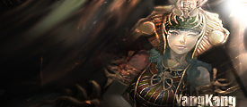
Ok i did what you guys said and i made my first sig. Tell me what ya think. Yes i did use Brushes this time and did not use distortion. ( exceptfor the light source.
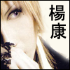
ANyone got any suggestions for a render for this would be cool thxs
Last edited by Vibrator on Fri Dec 28, 2007 9:52 pm, edited 9 times in total.
<<banned from SRF for remaking a banned account. -SG>>
I been working on this for past hours trying to make the colros perfect but not just randomness any one got a good render for this? And any tips for this likelower colros raise etc?
Edit: Just learned about burn tool seems cool
Yay just finished a 2nd one. I tried to make it to blend in as much as possible so tell me what ya think.
What you guys think i should do this one?
<<banned from SRF for remaking a banned account. -SG>>
Ok followed some tutorials. I used NO render i just did everything by hand. Me frst time doing this so go easy.
Or does this look better teh Suna s the Light Source.
I was tyring to go for a galaxy shooting comet look.
Rate 1-10 and things i should fix please thank you.
Edit: Justnoticed the S rate without that S please =D.
<<banned from SRF for remaking a banned account. -SG>>
purple/blue sig. Don't get me wrong, sometimes those are good colors for sigs, however this time it's not the case. Your first sig would go better with browns/grays and darker colors. Also put the opacity on 100% for the render. Second one is kinda odd... dunno.
it has a certain "flow". people talk about flow a lot in here and its basically a way of leading the eyes through a sig. yours has a flow from the mid bottom towards the outer corners. with some small tricks, you can make the flow even more clear and therefor the sig more successful.
you used vector brushes. these brushes are a good trick to quickly make a sig look different from other sigs.
bad:
color. the colors are too bright and too plain imo. also, the lightblue and dark blue dont really go well together. i do like the way the yellow-ish render is set on a blue background, but i would change the background to make it better.
background is plain. you started to work with the custom brushes. now its the trick to make the background into something suitable for your sig. in this case, one of the weakest points is the fact that you transformed the vector arrows, or drew arrows yourself which make em look funny. one more thing is that the background gets a little broing cause there is not much going on. also, i was talking about the flow of the sig, and with these vector brushes you will have more success going with the sigs flow than randomly pushing the brush button on the screen.
text. i dont like the text.. simply dont like it. the font is too plain and there is nothing going on really, except you brushed some lightblue over it. try to put your text layer on a different mode, like overlay/softlight/whatever, play around a little.
border. personal likings, i like sigs with border better, especially when that left arrow goes off the sig.
lightsource. the blue line in the top makes us believe there is some kind of lightsource, but there is a lot of work still to be done with it.
^ mind you, this is not a rant, just all the tips you need to take into consideration in your next sig. like i said, its already TONS better than your older ones, and you will see you will keep improving along the way!
Ok Cin i took your advice and i fixed it up a little this is just the theme im trying to show ya.
Version 1.2
This is what im doing Im trying to give it like the lightning and the blue Mana circle thing is surrounding him going around him.
This is the flow im trying to set
Edit: If you have asuggestions in what is hould add do please say whatcolor i should make it on xD.
I dont think that the vector circles will work hre but thats just me. Anyone got any tips for me? I dont want to start a new sig i want to finish 1 for first time =D.
<<banned from SRF for remaking a banned account. -SG>>
Woah you improved ;D Your sig has actually now a point the sigs before were just put in as much you can IMO I agree with the most points with cin but things I would say you need to fix
lightsource : I liked it how you made the lightsource in your first try but you should have made it a line more like a point but seriously it looks better with
background : I dont like the background to much you tried to make some halfcircle flow I would say but lightings arent the right choose for that
thats it actually :p you should try to mix the first and second try and use the points everyone here writes out to improve but overall you sure did improve keep on like that


