Digital art design, renderings, signatures and anything art related. Upload pictures of your newest work or ask for feedback. Post graphics requests or discuss art in general.
Hey guys im new to this Art stuff Im trying to do my first sig but having some problems. When I paste my picture, the background gets messed up, it does take the background of the old picture with it .. what do you guys do to solve that problem?
Edit :
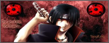
Its my first time I use photoshop... I had a damn hard time but **** im so proud of myself now XD
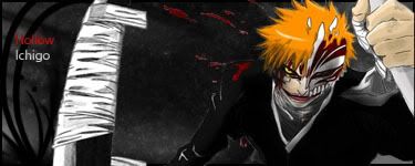
Made another one
I know the text sucks but ~.~ meh
Last edited by YangKang on Mon Dec 24, 2007 9:55 pm, edited 4 times in total.
There is selection tools, like: lasso, Polygonal Lasso Tool, magnetic lasso Tool...you can find them in the bar located in the left corner of Photoshop window. Just select object from the image, the copy and paste to other image.
I do but you got to be kidding... this is madness lol I cant even draw 2 lines that are straight on >_< wait Ill show you the pic where i want to cut out the background
YangKang wrote:I do but you got to be kidding... this is madness lol I cant even draw 2 lines that are straight on >_< wait Ill show you the pic where i want to cut out the background
I don't know about you guys about I use the marquee tool. Just select the part you want to cut out, Ctrl + C(Copy) then use Ctrl + V(Paste) to another document. If you want to cut out the WHOLE image, just Ctrl + A to automatically select the whole document with marquee, the copy and paste.
Nice job! thats far far better than my first sig (some would say its better than my sigs now ^_^ )
grats
My stories + songs Story Search: [Story] author Trice Parody Search: [Parody] author Trice Ty cin Sarcasm makes you more attractive to the opposite sex
excellent job for a first sig. you are in the stage where you have chosen a good render and have used some nice brushes, and done a decent job of not making it look pasted on. now try to do three new things:
a) define a significant light source. make the whole sig react to that light somehow.
b) establish a flow. the sig should make the eye naturally move from place to place in a way that makes sense.
c) work on havnig the render blend into the sig so that the two are one rather than individual layers.
they are not bad for first ones, but! the render on the second one is cut out REALLY bad, I advice you to use sites such as http://planetrenders.net for your cut outs
when you shrink your renders be sure to hold the shift key as to not strech them out. And use the corner squares to minimize cause int he sigs you just made both renders look too streched out or too big
nt