please R.N.S

Digital art design, renderings, signatures and anything art related. Upload pictures of your newest work or ask for feedback. Post graphics requests or discuss art in general.
Post Reply
User avatar
durkadurka
Common Member
Posts: 101
Joined: Thu Dec 06, 2007 5:34 pm
Quick Reply: Yes
Location: xian

please R.N.S

Post by durkadurka »

whatcha think?

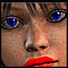
i used lighting effects this time i think better than i did before.

also faded my name into the bg a bit so that the render is the focal.

Image
Image
Image

- 67 pure int spear nuker - xian - Death_2_ALL - gld ldr insane rage - 4 - 420 union -

- 45 pure int nuker s/s - pesodin -

User avatar
Azn_Pride
Active Member
Posts: 740
Joined: Thu Nov 15, 2007 12:02 pm
Quick Reply: Yes
Location: Srf & Artist Corner :)

Post by Azn_Pride »

better than what i can do. nice :D
Ciddy Will Always Be In My Sig. <3
Image
Image[uBp_Knights * HaryPotrWall]

User avatar
HOLLAstir
Loyal Member
Posts: 1637
Joined: Tue Aug 28, 2007 7:17 pm
Quick Reply: Yes
Location: 206
Contact:

Post by HOLLAstir »

Well you don't need your text with so much opacity so we can barely see it. You can have your text be full and still have the render be the focal point. It's getting better, but the light source seems to be at an odd angle. The brushing doesn't seem to go with the sig either. Keep practicing <3
Image

Image

User avatar
durkadurka
Common Member
Posts: 101
Joined: Thu Dec 06, 2007 5:34 pm
Quick Reply: Yes
Location: xian

Post by durkadurka »

my border didnt show up around it either .... hrm


edit: no it did, lol the border was white
:P


there with border. now help me out with something. when you say the light is angled wrong ... why? and please help me with figuring out how to make the bg go with the render. i think im having issues with understand how this process works, cause i honestly thought the bg went with it lol
Image
Image

- 67 pure int spear nuker - xian - Death_2_ALL - gld ldr insane rage - 4 - 420 union -

- 45 pure int nuker s/s - pesodin -

User avatar
SuicideGrl
Retired Admin
Posts: 8004
Joined: Fri Jan 27, 2006 4:17 pm
Location: World of Warcraft

Post by SuicideGrl »

ok DD. improving a lot here. a few things:

your text issues come not from opacity (as Hollastir pointed out), but from size. general rule that i have found to be true is that text shouldn't be much larger than maybe 12pt; i often use 9-10pt myself.


your light-sourcing is improving a lot. this time, however, while you have the light coming from the right general area, it fell short of actually adequately lighting the sig because it leaves a noticible darker area at the top right corner of the sig. i can actually see exactly where you brushed on the light. if you had brushed another big fat dot right in that corner so that her entire face was lighted the same, it'd have served you almost perfectly, imo.

i have to disagree w/ hollastir in that i think the brushing works pretty well. it matches well color-wise, and while it doesn't really add to or draw from your render, it certainly doesn't clash.

also, your render itself is definitely smoother and more well-cut out than some of your previous ones.


my 2c.
Image
Thx IceCrash for my awesome sig :)
SRF Name Change Policy
Having trouble accessing SRF?

dom wrote:
RuYi wrote:Are you from outer space or something?
He's from Jersey. Close enough.

User avatar
Kikyo
Casual Member
Posts: 68
Joined: Fri Nov 16, 2007 6:23 am
Quick Reply: Yes
Location: Disney Land

Post by Kikyo »

how cute

User avatar
durkadurka
Common Member
Posts: 101
Joined: Thu Dec 06, 2007 5:34 pm
Quick Reply: Yes
Location: xian

Post by durkadurka »

which one do you think is better. this one, or my current sig?
Last edited by durkadurka on Tue Dec 11, 2007 7:00 am, edited 1 time in total.
Image
Image

- 67 pure int spear nuker - xian - Death_2_ALL - gld ldr insane rage - 4 - 420 union -

- 45 pure int nuker s/s - pesodin -

User avatar
SuicideGrl
Retired Admin
Posts: 8004
Joined: Fri Jan 27, 2006 4:17 pm
Location: World of Warcraft

Post by SuicideGrl »

maybe you should focus on one sig before starting on a bunch more? just a thought...


anyway, the new sig:

pros:
- text is MUCH better. great size, positioning, color is pulled from the render nicely.
- brushing and other background elements are tastefully done, make good use of space, match the sig's colors and create a nice flow.

cons:
- focal is way too blurry. having just used this stock myself in my gift sig to ColourBlind, i know that the original isn't very sharp to begin with, but you seem to have blurred Mr. Depp further, which makes him look washed-out.

try using a sharpening filter on JUST the render. see if you can get him to pop more. if you can achieve that, then this will be your most successful sig yet, imo.
Image
Thx IceCrash for my awesome sig :)
SRF Name Change Policy
Having trouble accessing SRF?

dom wrote:
RuYi wrote:Are you from outer space or something?
He's from Jersey. Close enough.

User avatar
HOLLAstir
Loyal Member
Posts: 1637
Joined: Tue Aug 28, 2007 7:17 pm
Quick Reply: Yes
Location: 206
Contact:

Post by HOLLAstir »

I like the colors of that one. I love johnny depp as well. Personally I like that one better then your current <3
Image

Image

User avatar
Kikyo
Casual Member
Posts: 68
Joined: Fri Nov 16, 2007 6:23 am
Quick Reply: Yes
Location: Disney Land

Post by Kikyo »

i like guys hip bones, you know the ones that are really fit.

User avatar
SuicideGrl
Retired Admin
Posts: 8004
Joined: Fri Jan 27, 2006 4:17 pm
Location: World of Warcraft

Post by SuicideGrl »

Kikyo wrote:i like guys hip bones, you know the ones that are really fit.

... off-topic much? Oo
Image
Thx IceCrash for my awesome sig :)
SRF Name Change Policy
Having trouble accessing SRF?

dom wrote:
RuYi wrote:Are you from outer space or something?
He's from Jersey. Close enough.

User avatar
durkadurka
Common Member
Posts: 101
Joined: Thu Dec 06, 2007 5:34 pm
Quick Reply: Yes
Location: xian

Post by durkadurka »

yea im jumping round different ideas maybe to find one that i like to work with ... each sig is different for me, where as a dark idea is easier for me to work with, when at the same time the lighter ideas i find are more difficult for me to come up with ...

thanks for the good comments tho, seems my current sig is my best one so far ^^ :D
Image
Image

- 67 pure int spear nuker - xian - Death_2_ALL - gld ldr insane rage - 4 - 420 union -

- 45 pure int nuker s/s - pesodin -

Luoma
Veteran Member
Posts: 3895
Joined: Thu Sep 14, 2006 8:23 am
Quick Reply: Yes
Location: Artists Corner & Aege

Post by Luoma »

Sig looks pretty good, although i didn't notice the text until you told me.
Also it could need some more depth and background work.

Still nice :]

SuicideGrl wrote:
Kikyo wrote:i like guys hip bones, you know the ones that are really fit.

... off-topic much? Oo


Just take a look over all his/her posts xD
<<banned from SRF for proof of botting. -SG>>

User avatar
durkadurka
Common Member
Posts: 101
Joined: Thu Dec 06, 2007 5:34 pm
Quick Reply: Yes
Location: xian

Post by durkadurka »

Luoma wrote:Sig looks pretty good, although i didn't notice the text until you told me.
Also it could need some more depth and background work.

Still nice :]

SuicideGrl wrote:
Kikyo wrote:i like guys hip bones, you know the ones that are really fit.

... off-topic much? Oo


Just take a look over all his/her posts xD


gotta get more post numbers some how :P
Image
Image

- 67 pure int spear nuker - xian - Death_2_ALL - gld ldr insane rage - 4 - 420 union -

- 45 pure int nuker s/s - pesodin -

Post Reply

Return to “Artists Corner”