
Attempt 2


-
SuicideGrl

- Retired Admin
- Posts: 8004
- Joined: Fri Jan 27, 2006 4:17 pm
- Location: World of Warcraft
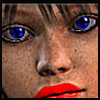
he pops a little too much for me, especially compared w/ your The Game sig.
however, i really like what you've done here. your text is especially tasty, i like how you have made it your own w/ the little touches.
i'm also a fan of how all your effect elements seem to be splattery and nondesticnt, rather than perfectly formed. wouldn't mind knowing what kinds of brushes you used, if any.
this one definitely is more... complete... than the other one somehow.

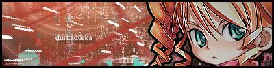
Thx IceCrash for my awesome sig :)
SRF Name Change Policy
Having trouble accessing SRF?
dom wrote:He's from Jersey. Close enough.RuYi wrote:Are you from outer space or something?

I love it, man. One of the nicest Sigs that I've seen around here in a while. I definitely like the color scheme - yellow and a light blue/turquoise - and the text looks awesome as well. Hollister seagull fits right into the spot where you placed it.
However, like everyone else said, your render still pops out a little bit. It's starting to look like you just slapped your render onto a background that you made beforehand, and then called it a day. Create depth, but not too much depth, that it's so blatantly obvious.
Another thing is your border. I'm not sure if I like that bright blue as a border. It's a bit too luminescent for me to put around the edge of your Sig.
Overall, it's a nice, nice Sig. 9/10 from me!
-
HOLLAstir

- Loyal Member
- Posts: 1637
- Joined: Tue Aug 28, 2007 7:17 pm
- Quick Reply: Yes
- Location: 206
- Contact:
SuicideGrl wrote:i'm also a fan of how all your effect elements seem to be splattery and nondesticnt, rather than perfectly formed. wouldn't mind knowing what kinds of brushes you used, if any.
The brushes are off deviantart. They are called Brushset002 and SpazzSplatter. There is one more but I can't remember which one it is. But thanks all for the comments, i'll work on my render looking more part of the sig rather then standing out so much <3


-
BrokenSaint

- Veteran Member
- Posts: 3473
- Joined: Sun Jan 01, 2006 8:49 pm
- Quick Reply: Yes
- Location: Stuntin'.
- Contact:

-
durkadurka
- Common Member
- Posts: 101
- Joined: Thu Dec 06, 2007 5:34 pm
- Quick Reply: Yes
- Location: xian
-
durkadurka
- Common Member
- Posts: 101
- Joined: Thu Dec 06, 2007 5:34 pm
- Quick Reply: Yes
- Location: xian
Re: Attempt 2
HOLLAstir wrote:Messed around with two C4D's. Smudged and what not. Just trying to get used to everything again. Holla
between this one above and his sig one... oir is that not what yall are talking about... ? o.O
- 67 pure int spear nuker - xian - Death_2_ALL - gld ldr insane rage - 4 - 420 union -
- 45 pure int nuker s/s - pesodin -
-
durkadurka
- Common Member
- Posts: 101
- Joined: Thu Dec 06, 2007 5:34 pm
- Quick Reply: Yes
- Location: xian
ah ha ... it makes sense now to me lmao... i was sitting back searching hard for any changes.. .i was begining to think you people made me feel like i was taking crazy pills lmao
- 67 pure int spear nuker - xian - Death_2_ALL - gld ldr insane rage - 4 - 420 union -
- 45 pure int nuker s/s - pesodin -