thanks


Misaklo wrote:Well don't trust me too much, I've greatly improved since what's in my sig now but don't really have time to practice any ATM.
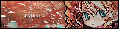
On the plus side i like the background; very good for a first sig.
The text is also a lot better than what a lot of people choose for their first sig, not too distracting, but try using something a little simpler and really getting it to blend.
You're render, to be honest, doesn't fit at all, the sig would have looked better without it. It's usually better to either choose you're render first and adjust the sig's style accordingly (simple lines, not too much depth, good colour for this one). Or be prepared to go through many renders to get one thats fits a BG you've already made. There's always the abstract no render too...
Overall pretty OK, more so for a first sig 4/10. Just get a better render.
Sorry about the long post, i feel wordy today


0l3n wrote:Havnt seen you around in a long time.
Misaklo wrote:0l3n wrote:Havnt seen you around in a long time.
Yeah i started again after leaving for WoW, came back cause i didn't really have time and didn't feel like paying for something i wasn't going to use. I've been lurking for a little over a month or 2 now.

0l3n wrote:Misaklo wrote:0l3n wrote:Havnt seen you around in a long time.
Yeah i started again after leaving for WoW, came back cause i didn't really have time and didn't feel like paying for something i wasn't going to use. I've been lurking for a little over a month or 2 now.
You dont know how glad I am to see a familiar face aroound here, everyone seems to be leaving.
And Misaklo summed it up pretty good.


dom wrote:He's from Jersey. Close enough.RuYi wrote:Are you from outer space or something?

0l3n wrote:Just a random hing here, your name, durkadurka is a tad long. This will make it harder to place in sigs. If I were you id get a nickname like DD or something so its easier to properly place in a sig.
SuicideGrl = SG
BrokenSaint = Brkn
hemagoku = hema
You catch my drift?


0l3n wrote:Just a random hing here, your name, durkadurka is a tad long. This will make it harder to place in sigs. If I were you id get a nickname like DD or something so its easier to properly place in a sig.
SuicideGrl = SG
BrokenSaint = Brkn
hemagoku = hema
You catch my drift?