Gift Sig - Kratos
- SuicideGrl
- Retired Admin
- Posts: 8004
- Joined: Fri Jan 27, 2006 4:17 pm
- Location: World of Warcraft
Gift Sig - Kratos
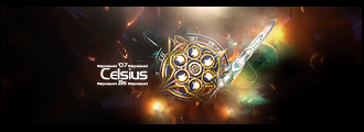
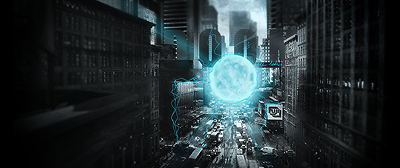
got another request for a sig in the same style as mine and zypher's. this time i experimented w/ the burn tool, yay :) sorry for posting more of the same, but c/c please.


Thx IceCrash for my awesome sig :)
SRF Name Change Policy
Having trouble accessing SRF?
dom wrote:He's from Jersey. Close enough.RuYi wrote:Are you from outer space or something?
-
Snudge
- Senior Member
- Posts: 4200
- Joined: Sun Jun 11, 2006 8:20 pm
- Quick Reply: Yes
- Location: Artist Corner
- Contact:
Re: Gift Sig - Kratos
SuicideGrl wrote:got another request for a sig in the same style as mine and zypher's. this time i experimented w/ the burn tool, yaysorry for posting more of the same, but c/c please.
FLOATING HEEEEAD!
<<banned from SRF for proof of botting. -SG>>
-
TwelveEleven
- Veteran Member
- Posts: 3806
- Joined: Sat Mar 17, 2007 1:11 am
- Quick Reply: Yes
- Location: Heaven
- Contact:
- aazumak
- Active Member
- Posts: 918
- Joined: Sat Jun 09, 2007 12:56 pm
- Quick Reply: Yes
- Location: Artist Corner
- Contact:
i like it, what i would suggest is,
take that burn tool,
make it really big,
make it have a low opacity of like 20% or less,
burn the edges a bit- from like the edge to 1/3 of the way in,
but do it just a little little little bit,
just to make it have more of a focal point
take that burn tool,
make it really big,
make it have a low opacity of like 20% or less,
burn the edges a bit- from like the edge to 1/3 of the way in,
but do it just a little little little bit,
just to make it have more of a focal point


_____________________!!!!!!Rogue 7X !!!!!!

- SuicideGrl
- Retired Admin
- Posts: 8004
- Joined: Fri Jan 27, 2006 4:17 pm
- Location: World of Warcraft
aazumak wrote:i like it, what i would suggest is,
take that burn tool,
make it really big,
make it have a low opacity of like 20% or less,
burn the edges a bit- from like the edge to 1/3 of the way in,
but do it just a little little little bit,
just to make it have more of a focal point
ok, but what am i burning? highlights? midtones? shadows?
the options on that tool confuse me, and it didn't perform the way i expected.

Thx IceCrash for my awesome sig :)
SRF Name Change Policy
Having trouble accessing SRF?
dom wrote:He's from Jersey. Close enough.RuYi wrote:Are you from outer space or something?
The girl's pretty ugly, but aside from that it's an alright sig, although instead of doing whatever you did on the large empty lsection on the left, you should have continued with the exact same type of thing that you were doing on the right side of her head (effect-wise, I'm well aware that it's a similar pattern)
Random only works in eclectic pieces.
Random only works in eclectic pieces.

-No longer connecting due to server traffic
- Dugu
- Casual Member
- Posts: 64
- Joined: Sun Jul 08, 2007 1:13 pm
- Quick Reply: Yes
- Location: Come find me
You burn to give your signature more depth and a three dimensional feeling, it also serves to contrast your focal without you dodging it, which will change the complexion of the face.
Light Source- Fits with the render but not the whole signature. The vector brushes to the right, where the light is, is dark whereas the left are shades of white. You seem to leave out the light in half the piece and have it in the other half.
Random white dot things- Nothing against white dots and the 'dust' feel but your's is a little random. They're all over your vector and cancels out the pop-out feelings your vector would give off otherwise. I would definitely recommend that you move your dots into some sort of pattern or flow.
Background- It has me a little confused, it seems to want to be simple yet the edges are all grainy, canceling out the smooth sharp feel the background gives off. I think you can add more decoration in the background, or take a bit off and keep it simple. Or at least make the transition from dark blue to baby blue a little smoother (not blurring though)
Text- Again, no reflection on the fact that you have a light source. I bit more texture could help out the text too, make it opaque and maybe add a clipping mask with low opacity that's been dissolved to add a bit of texture, which doubles as a good way to show off lighting.
Head- It's been mentioned that your head is coming from nowhere apparently, which is why I believe that add more work there would help. You already have something in the upper left, now do a tiny bit with lower middle to lower left. It shouldn't be as distinct as the top, but a little something, maybe low opacity and/or blurred would help the head look more natural.
Charles Caleb Colton wrote:We hate some persons because we do not know them; and will not know them because we hate them.

- [SD]Kratos
- Senior Member
- Posts: 4785
- Joined: Mon Apr 24, 2006 9:48 am
- Quick Reply: Yes
- Location: Venus
- 0l3n
- Elite Member
- Posts: 5184
- Joined: Fri Jun 16, 2006 1:45 pm
- Quick Reply: Yes
- Location: Artists Corner
Dugu wrote:You burn to give your signature more depth and a three dimensional feeling, it also serves to contrast your focal without you dodging it, which will change the complexion of the face.
Light Source- Fits with the render but not the whole signature. The vector brushes to the right, where the light is, is dark whereas the left are shades of white. You seem to leave out the light in half the piece and have it in the other half.
Random white dot things- Nothing against white dots and the 'dust' feel but your's is a little random. They're all over your vector and cancels out the pop-out feelings your vector would give off otherwise. I would definitely recommend that you move your dots into some sort of pattern or flow.
Background- It has me a little confused, it seems to want to be simple yet the edges are all grainy, canceling out the smooth sharp feel the background gives off. I think you can add more decoration in the background, or take a bit off and keep it simple. Or at least make the transition from dark blue to baby blue a little smoother (not blurring though)
Text- Again, no reflection on the fact that you have a light source. I bit more texture could help out the text too, make it opaque and maybe add a clipping mask with low opacity that's been dissolved to add a bit of texture, which doubles as a good way to show off lighting.
Head- It's been mentioned that your head is coming from nowhere apparently, which is why I believe that add more work there would help. You already have something in the upper left, now do a tiny bit with lower middle to lower left. It shouldn't be as distinct as the top, but a little something, maybe low opacity and/or blurred would help the head look more natural.
Love Dugu or die!
- SuicideGrl
- Retired Admin
- Posts: 8004
- Joined: Fri Jan 27, 2006 4:17 pm
- Location: World of Warcraft
Dugu wrote:<<some of the best comments/criticisms i've ever had on here>>
wow, thanks Dugu. that's how i will get better.
- still not really understanding the burn tool. if anyone has a link to (or is willing to make) a good quick tut, lemme know.
- agree completely w/ the lightsource issue. never noticed it or gave it a 2nd thought. in fact, i never even considered the effect of my lightsource on my background elements. guh.
- i used the pen tool to follow the curves of my vector for the "dust" effect. it was intentional, but apparently didn't have the desired effect. next time, i'll give it its own space.
- i used a big scatter brush in the bg, which is giving the grainy effect. just a case of poor brush choice.
- see my above response to treating my bg w/ the lightsource. never considered it. duly noted.
- the original from which i pulled the focal:
http://suicidegirls.com/media/girls/Anemona/photos/Blue%20Girl%20Blue/setpreview_large.jpg
linked it because it's bordering on NSFW. any comments you can make as to how i could have better pulled her out of that would be appreciated.
thanks a lot!

Thx IceCrash for my awesome sig :)
SRF Name Change Policy
Having trouble accessing SRF?
dom wrote:He's from Jersey. Close enough.RuYi wrote:Are you from outer space or something?


