My New Siggy

Digital art design, renderings, signatures and anything art related. Upload pictures of your newest work or ask for feedback. Post graphics requests or discuss art in general.
Post Reply
User avatar
Tatianasaphira
Active Member
Posts: 596
Joined: Fri May 12, 2006 1:12 pm
Quick Reply: Yes
Location: Oasis
Contact:

My New Siggy

Post by Tatianasaphira »

Hope you all like it:

Image
Image
ImageImage

User avatar
dom
Global Moderator
Global Moderator
Posts: 9962
Joined: Wed Mar 08, 2006 10:46 pm
Quick Reply: Yes
Location: västkustskt

Post by dom »

Farking big
Image

User avatar
Tatianasaphira
Active Member
Posts: 596
Joined: Fri May 12, 2006 1:12 pm
Quick Reply: Yes
Location: Oasis
Contact:

Post by Tatianasaphira »

Is that bad or is that good?

Btw just finished my new avatar
Image
ImageImage

User avatar
Oblivion
Valued Member
Posts: 395
Joined: Sun Apr 16, 2006 6:07 pm
Quick Reply: Yes
Location: Venice

Post by Oblivion »

I think he ment it in a negative way ... but i like them both avatar and sign, nice work :)
Image
Image
Image
Image

User avatar
N00ber_B00ber
Casual Member
Posts: 58
Joined: Fri Apr 28, 2006 2:28 am
Quick Reply: Yes
Location: athens

Post by N00ber_B00ber »

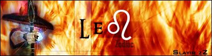
sry dont like it cuz its too big. idk what the idea was originally but i thout of ripped paper, that would create an awesome effect. i made somethin like it fer a projec before, it kicked arse. dont relly like the font, fade the chars a bit more and make the glow much smaller, it would look kick ass.
Image

User avatar
naljamees51
Frequent Member
Posts: 1054
Joined: Tue Mar 21, 2006 1:34 pm
Quick Reply: Yes
Location: Estonia

Post by naljamees51 »

i like the siggi...ya but its do big...
but i dont like balooooons
Image


I'm gay, lets cry.

User avatar
Shimohime
Active Member
Posts: 788
Joined: Tue Feb 28, 2006 11:40 pm
Quick Reply: Yes
Location: Xian

Post by Shimohime »

Yea, the ballons detract from the sig. The sig also has too much unnecessary space and draws the viewer away from the actual content.
Lvl 5x- Ice Archer

Read my avatar tutorial here

User avatar
Tatianasaphira
Active Member
Posts: 596
Joined: Fri May 12, 2006 1:12 pm
Quick Reply: Yes
Location: Oasis
Contact:

Post by Tatianasaphira »

Hmmm...well how about something like this:

Image
Image
ImageImage

User avatar
Cuda
New Member
Posts: 45
Joined: Sun Jun 04, 2006 6:47 pm

Post by Cuda »

Not a really good I dea to add any exterior blending effects on a .gif. adds that wierd white stroke to it. the anim itself is ok, but do something with the text.
Image


Name:-
Guild:-
build:-
Selling:-

User avatar
dom
Global Moderator
Global Moderator
Posts: 9962
Joined: Wed Mar 08, 2006 10:46 pm
Quick Reply: Yes
Location: västkustskt

Post by dom »

Tatianasaphira wrote:Hmmm...well how about something like this:

Image


First one by far
Image

User avatar
Tatianasaphira
Active Member
Posts: 596
Joined: Fri May 12, 2006 1:12 pm
Quick Reply: Yes
Location: Oasis
Contact:

Post by Tatianasaphira »

hehehe....okay okay...it was worth a try to do animations again..
Image
ImageImage

User avatar
Nannari
Regular Member
Posts: 323
Joined: Sun Apr 16, 2006 4:28 pm
Quick Reply: Yes
Location: Odin

Post by Nannari »

I think you should remove the green-blueish background from the first sig, so that the "ripped paper" edge really is the edge... make it a png for that to look kewl.
Image

dom wrote: I never use more then 20~gb, and most of that is in porn alone.

User avatar
Tatianasaphira
Active Member
Posts: 596
Joined: Fri May 12, 2006 1:12 pm
Quick Reply: Yes
Location: Oasis
Contact:

Post by Tatianasaphira »

Okay...Final Attempt:

Image
Image
ImageImage

Post Reply

Return to “Artists Corner”