OK because I seriously fail at art, I was thinking of buying a premade template for my guild site.
Although, theres not a whole lot to choose from, on the template sites I found.
I thought about buying one of these.
Template
Template
Both of them off
http://www.portalthemes.com/index.php?m ... startnum=0
These are cheep, accomodate all the boxes we need. No one seems to like the colors though, and the banners are the suck.
Course, a new banner can be made, but thats pretty challenging for me.
Lots of those are pretty good.... all of them need changes to fit an alliance guild, and our name etc. Some are horde art... don't work
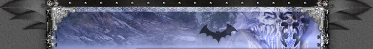
This is way cool. But uh, way goth too =(
Template
Simple enough.... New image required. Not all that catchy tho
Template
I like this one too. And look, its already got warcraft images. =)
Template
This is cool... um... chick a bit extreme... fire...death...kill. Hum.
Template
Website Template- Feedback ?
-
TwelveEleven
- Veteran Member
- Posts: 3806
- Joined: Sat Mar 17, 2007 1:11 am
- Quick Reply: Yes
- Location: Heaven
- Contact:

-
Ryoko

- Site Owner
- Posts: 6390
- Joined: Fri Dec 30, 2005 8:32 pm
- Quick Reply: Yes
- Location: Off Topic
- Contact:
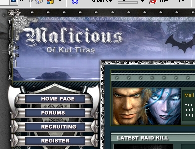
Meeting last night, were gonna go with this template.
All that needs to be done is our own text and images, and a "Malicious" logo at the top left instead of Game Club.
All that needs to be done is our own text and images, and a "Malicious" logo at the top left instead of Game Club.
-
Foilin

- Frequent Member
- Posts: 1200
- Joined: Wed May 10, 2006 6:47 pm
- Quick Reply: Yes
- Location: Once Xian, Now Garrosh (US). TEXAS IRL!
Ryoko wrote:Meeting last night, were gonna go with this template.
All that needs to be done is our own text and images, and a "Malicious" logo at the top left instead of Game Club.
So, just wwhere the text is? or the whole "banner" area?


-
TwelveEleven
- Veteran Member
- Posts: 3806
- Joined: Sat Mar 17, 2007 1:11 am
- Quick Reply: Yes
- Location: Heaven
- Contact:


-
TwelveEleven
- Veteran Member
- Posts: 3806
- Joined: Sat Mar 17, 2007 1:11 am
- Quick Reply: Yes
- Location: Heaven
- Contact:
-
Xyzzzy

- Addicted Member
- Posts: 2629
- Joined: Sun May 20, 2007 10:20 pm
- Quick Reply: Yes
- Location: Off Topic
- Contact:
TwelveEleven wrote:dom wrote:The first two look so 1995.
Yes and that's how much they cost, 19,95
rofl perfect
XemnasXD wrote:also im not going to stop calling him a cosmic douche, anyone that knows everything about everything, then creates you knowing full you won't end up following the rules he's made up for you, then punishes you for all eternity for it....come on...thats just being a d*ck.
-
nightbloom
- Elite Member
- Posts: 5492
- Joined: Fri Jan 20, 2006 2:11 am
- Quick Reply: Yes
- Location: Venus
- Contact:
Any Gothic font will do. They used PS to give it texture and dimension.
Try one of these... http://www.1001freefonts.com/gothic-fonts.htm
Or these: http://www.dafont.com/theme.php?cat=401
Try one of these... http://www.1001freefonts.com/gothic-fonts.htm
Or these: http://www.dafont.com/theme.php?cat=401
<<banned from SRF for rules violations: being a constant problem. -SG>>
-
Ryoko
- Site Owner
- Posts: 6390
- Joined: Fri Dec 30, 2005 8:32 pm
- Quick Reply: Yes
- Location: Off Topic
- Contact:
nightbloom wrote:Any Gothic font will do. They used PS to give it texture and dimension.
Try one of these... http://www.1001freefonts.com/gothic-fonts.htm
Or these: http://www.dafont.com/theme.php?cat=401
/Kisses
-
TwelveEleven
- Veteran Member
- Posts: 3806
- Joined: Sat Mar 17, 2007 1:11 am
- Quick Reply: Yes
- Location: Heaven
- Contact:


-
nightbloom
- Elite Member
- Posts: 5492
- Joined: Fri Jan 20, 2006 2:11 am
- Quick Reply: Yes
- Location: Venus
- Contact:


-
Snudge
- Senior Member
- Posts: 4200
- Joined: Sun Jun 11, 2006 8:20 pm
- Quick Reply: Yes
- Location: Artist Corner
- Contact:
RuYi wrote:nightbloom wrote:It's smaller than I expected.
(And no guy likes to hear THAT)
But seriously, it's very narrow with a lot of blank space on either side. But other than that, I like it.
Well maybe that's the idea behind it.
If he made it huge, people would think he had something little to compensate.
You guys are evil... XD
<<banned from SRF for proof of botting. -SG>>


-
TwelveEleven
- Veteran Member
- Posts: 3806
- Joined: Sat Mar 17, 2007 1:11 am
- Quick Reply: Yes
- Location: Heaven
- Contact:
Snudge wrote:RuYi wrote:nightbloom wrote:It's smaller than I expected.
(And no guy likes to hear THAT)
But seriously, it's very narrow with a lot of blank space on either side. But other than that, I like it.
Well maybe that's the idea behind it.
If he made it huge, people would think he had something little to compensate.
You guys are evil... XD
really evil
<<banned from SRF for proof of botting. -SG>>
TwelveEleven wrote:Snudge wrote:RuYi wrote:nightbloom wrote:It's smaller than I expected.
(And no guy likes to hear THAT)
But seriously, it's very narrow with a lot of blank space on either side. But other than that, I like it.
Well maybe that's the idea behind it.
If he made it huge, people would think he had something little to compensate.
You guys are evil... XD
really evil
Yea RyO be really sad
-
Foilin
- Frequent Member
- Posts: 1200
- Joined: Wed May 10, 2006 6:47 pm
- Quick Reply: Yes
- Location: Once Xian, Now Garrosh (US). TEXAS IRL!
*SunShine wrote:TwelveEleven wrote:Snudge wrote:RuYi wrote:nightbloom wrote:It's smaller than I expected.
(And no guy likes to hear THAT)
But seriously, it's very narrow with a lot of blank space on either side. But other than that, I like it.
Well maybe that's the idea behind it.
If he made it huge, people would think he had something little to compensate.
You guys are evil... XD
really evil
Yea RyO be really sad
But he ask what we think so LOL
rofl, hi nb!