Digital art design, renderings, signatures and anything art related. Upload pictures of your newest work or ask for feedback. Post graphics requests or discuss art in general.
I like it a lot, I can't give advice on how to improve though since I'm a ps noob =]
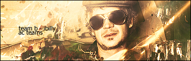
9/10
XemnasXD wrote:also im not going to stop calling him a cosmic douche, anyone that knows everything about everything, then creates you knowing full you won't end up following the rules he's made up for you, then punishes you for all eternity for it....come on...thats just being a d*ck.
Not all works of art have specific focals, sometimes the artist wants you to find your own meaning through it and doesn't want to make you think a certain way. Remember that this type of art doesn't have an obvieous subject like my sig, or Rek's sig, its just a creative work of art ^_^.
I agree with the above said, your recent work is really shining, but I see you losing alot of contrast in your pieces. I think you are on your way to developing a nice style for yourself. I would recomend you seek out a tutorial that is nothing like your style and finish it all the way through, then try to incorporate this new 'thing' into a piece with your feel. Bridge out a bit.
Rizla wrote:I agree with the above said, your recent work is really shining, but I see you losing alot of contrast in your pieces. I think you are on your way to developing a nice style for yourself. I would recomend you seek out a tutorial that is nothing like your style and finish it all the way through, then try to incorporate this new 'thing' into a piece with your feel. Bridge out a bit.
Your two signatures that are displaying both have the same rustic and vapid feel which has both pros and cons. The use of black is very well done in terms of shaping and outlining however I believe you could have done more with the shadows, reflection, or whatever you were trying to accomplish with circles of blurred black. Using the abstract design, the signature gives a nice sense of three dimensional objects, but the arrangement of the lighting is a little flawed as some parts that would be hit from behind by the 'light' is as dark as the front of the same object. The transition from blue to red could have been smoother, maybe mirror it after the transition from red to green. The piece as a whole is mellow but the cyan inside the blue stands out, maybe unnecessarily. From the center to the white I noticed a little smudged yellow that resembles vague eraser marks, I think you could've done the same for the entire border around the centerpiece in the respective color as it adds to the rustic feel of it; however, I would not recommend making it too visible, traces of it is more than enough for the tone. You filled empty space with a background pale blue picture, unfortunately this is lost on the top of both the right and left. The left is balanced out by the text, but on the right side my eyes are searching for the pale blue however I find nothingness. Although this may have been what you were going for, the balance of the light blue would have been a good addition to the right side. As someone mentioned above, your work has become more mild in terms of contrast and colors; there are many ways to contrast colors and still have the piece look mild which I believe if you worked on can only help you at this point.
4/5
Charles Caleb Colton wrote:We hate some persons because we do not know them; and will not know them because we hate them.
Hah okay, well the black dots where supposed to be 'shining' up the focal, but unfortunately later on i have failed, i added a bunch of layeres and set them to hue, hoping something good will come out of it and no it didnt, so i added a green to white gradient map and set it to lumin.
What i was going for was a black background with a very appealing focal, but i screwed up and made something else
The end is the beginning of another is usually how i would describe most ending layers in my sig rofl