Improving Time

Digital art design, renderings, signatures and anything art related. Upload pictures of your newest work or ask for feedback. Post graphics requests or discuss art in general.
Post Reply
User avatar
Grim
Valued Member
Posts: 402
Joined: Thu Apr 05, 2007 9:38 pm
Quick Reply: Yes
Location: Red Sea

Improving Time

Post by Grim »

Alright,

This is the sig I choose to try to make it really good.

How can I improve this sig, all critiscm will be accepted.
OLD ONE:
Image

NEW ONE:
Image
Last edited by Grim on Mon Jul 09, 2007 2:50 pm, edited 2 times in total.
Image

TwelveEleven
Veteran Member
Posts: 3806
Joined: Sat Mar 17, 2007 1:11 am
Quick Reply: Yes
Location: Heaven
Contact:

Post by TwelveEleven »

It's pretty nice, but imo you should change the font, something need. And perhaps use the other colors in bowser instead of green.

Overall pretty nice 7.5/10

And maybe use the border like aazumak, he made a tut. Read my comment on it as that's a bit faster :P
<<banned from SRF for proof of botting. -SG>>

User avatar
bluey
Valued Member
Posts: 400
Joined: Mon Jan 29, 2007 9:22 pm
Quick Reply: Yes
Location: Athens

Post by bluey »

I agree with Twelve, its really nice, but in my opinion it needs a changing of the text style or coloring. Its really hard to critique someones work though because every artist has their own unique approach to art.

Anywho, I rate it a 7.86 / 10 xD

cin

Post by cin »

yay i <3 it when the character pops out.

be sure to save it as a *.gif image to keep the transparency otherwise
it will look weird on blue. if you save as .gif you might want to upload
it to http://www.xs.to cuz i think photobucket doesnt do gif files..

TwelveEleven
Veteran Member
Posts: 3806
Joined: Sat Mar 17, 2007 1:11 am
Quick Reply: Yes
Location: Heaven
Contact:

Post by TwelveEleven »

photobucket <3 *.gif images.. Check my photobucket page, it has some animated gifs, Anyways use .png if you have a none animated transparent image.
<<banned from SRF for proof of botting. -SG>>

User avatar
Dugu
Casual Member
Posts: 64
Joined: Sun Jul 08, 2007 1:13 pm
Quick Reply: Yes
Location: Come find me

Post by Dugu »

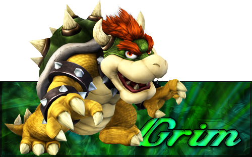
The light on the right should be mirrored on the left, the background should be a little more visible so turn the opacity up, the border can be a little bigger but it's classy now so I don't feel too strongly about it, if you're going to be hiding your text behind the very good looking bowser render then maybe hide it more, if you only hide a little bit it looks like an error rather than deliberate, and maybe have a bit more contrast in the background, between the dark and light green.

Well, that was a long run-on sentence, just imagine it all said in one breath. Also, you need the signature, Nintendo patented, flashing seizure lights.

TwelveEleven
Veteran Member
Posts: 3806
Joined: Sat Mar 17, 2007 1:11 am
Quick Reply: Yes
Location: Heaven
Contact:

Post by TwelveEleven »

You made an account just to say that? :shock:

Anyways I don't agree with you on the text part. It doesn't look like an error to me.
<<banned from SRF for proof of botting. -SG>>

User avatar
Grim
Valued Member
Posts: 402
Joined: Thu Apr 05, 2007 9:38 pm
Quick Reply: Yes
Location: Red Sea

Post by Grim »

Ok, I updated my first post with the requests.

Please, Anything could help it, Riz,Ell,Rek Please critize me.
Image

Post Reply

Return to “Artists Corner”