Digital art design, renderings, signatures and anything art related. Upload pictures of your newest work or ask for feedback. Post graphics requests or discuss art in general.
DShadow
Regular Member
Posts: 343 Joined: Mon Jul 02, 2007 4:37 pmQuick Reply: YesLocation: Olympus
Contact:
Post
by DShadow Fri Jul 06, 2007 4:26 am
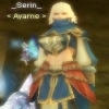
I just made a new sig, and would like some comments on how to improve it
cin
Post
by cin Fri Jul 06, 2007 4:31 am
i think its very, very nice. i like the simplicity and it just looks good.
DShadow
Regular Member
Posts: 343 Joined: Mon Jul 02, 2007 4:37 pmQuick Reply: YesLocation: Olympus
Contact:
Post
by DShadow Fri Jul 06, 2007 4:33 am
cin wrote: i think its very, very nice. i like the simplicity and it just looks good.
Thanks, glad to know I did pretty well on my first shining animation.
Silver0
Advanced Member
Posts: 2148 Joined: Fri Apr 20, 2007 2:46 amQuick Reply: YesLocation: 5 Mins Ahead
Post
by Silver0 Fri Jul 06, 2007 5:00 am
i like it
If the concept of us being all one consciousness's and us being one thing that lives endless through the cycle of nature the only clear emotion would be understanding .
we be in a utopia
Dystopia
Advanced Member
Posts: 2317 Joined: Thu Jan 04, 2007 8:37 pmQuick Reply: YesLocation: Off Topic
Post
by Dystopia Fri Jul 06, 2007 6:24 am
Lower the opacity on the shine.
and maybe make the text a little higher..
athats all i have to say rlly..
cin <3's pop up sigs
TwelveEleven
Veteran Member
Posts: 3806 Joined: Sat Mar 17, 2007 1:11 amQuick Reply: YesLocation: Heaven
Contact:
Post
by TwelveEleven Fri Jul 06, 2007 7:02 am
@ dys it's a pop-out
And I agree with dys, and you would do go to fasten the shine a bit.
<<banned from SRF for proof of botting. -SG>>
Zypher
Forum God
Posts: 8705 Joined: Tue Sep 12, 2006 11:41 pmQuick Reply: YesLocation: Canada
Post
by Zypher Fri Jul 06, 2007 8:30 am
i like everything but the shine, i think it should be faster and the opac. should be lighter
Snudge
Senior Member
Posts: 4200 Joined: Sun Jun 11, 2006 8:20 pmQuick Reply: YesLocation: Artist Corner
Contact:
Post
by Snudge Fri Jul 06, 2007 9:46 am
I think the cut-out is f*cked up, but at this size it's fine.
I'd give it a 7/10 due to it's lovely simplicity
<<banned from SRF for proof of botting. -SG>>
razorback
Hi, I'm New Here
Posts: 21 Joined: Sun Jun 24, 2007 4:45 pmQuick Reply: YesLocation: Eldorado
Contact:
Post
by razorback Fri Jul 06, 2007 12:54 pm
Oblivion
Valued Member
Posts: 395 Joined: Sun Apr 16, 2006 6:07 pmQuick Reply: YesLocation: Venice
Post
by Oblivion Fri Jul 06, 2007 1:11 pm
I love it
you could do the animated part a bit better, closer to the real one but good one anyway
9/10
TwelveEleven
Veteran Member
Posts: 3806 Joined: Sat Mar 17, 2007 1:11 amQuick Reply: YesLocation: Heaven
Contact:
Post
by TwelveEleven Fri Jul 06, 2007 1:19 pm
Do the cut-out a lil better though, especially around the talismans
<<banned from SRF for proof of botting. -SG>>
_Shinigami_
Advanced Member
Posts: 2191 Joined: Tue May 29, 2007 9:25 pmQuick Reply: YesLocation: Babel
Post
by _Shinigami_ Fri Jul 06, 2007 1:57 pm
wish i could make a sig. like that
CrimsonNuker
Dom's Slut
Posts: 13791 Joined: Sun Aug 06, 2006 3:31 amQuick Reply: YesLocation: guildwars2
Post
by CrimsonNuker Fri Jul 06, 2007 9:41 pm
pretty nice for a sro render pop-out