Digital art design, renderings, signatures and anything art related. Upload pictures of your newest work or ask for feedback. Post graphics requests or discuss art in general.
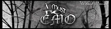
The motion blur on it doesnt look that good. Try doing something to the text instead of just slapping it on. and the border colour doesnt fit in with the stock colours.
I give it a 5/10. Keep trying pj, you'll get it
Last edited by rek on Tue Jun 19, 2007 10:10 am, edited 1 time in total.
i disagree about the border, i think it's pretty close to the BG color of the stock, but i can see where reK is going w/ that comment.
as for the motion blur, i think it's a pretty cool effect. the text, however is a) too close to the edges and b) pretty bland. the font choice is cool, but displayed like it is it's hade to read.
The motion blur on it doesnt look that good. Try doing something to the text instead of just slapping it on. and the border colour doesnt fit in with the stock colours.