Digital art design, renderings, signatures and anything art related. Upload pictures of your newest work or ask for feedback. Post graphics requests or discuss art in general.
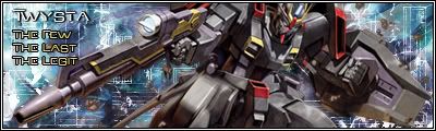
Well I just "got" ps yesterday because making sigs seemed to be all the rage and looked pretty fun, so here's my first try, with the help of some informative tuts.
Comments? I know the brush work is really sloppy and I did a bunch of random filters and layer styles to it because all of them looked cool
Last edited by Ell on Mon Jun 18, 2007 6:44 am, edited 2 times in total.
TwelveEleven wrote:Twysta, no offence. But if you made your own sig. His > Yours. (Matter of taste of course)
erm.. was that really necessary?
Anyway, aced it for a first try m8, go and make some more.
Pardon me, he says i can see you're not an experienced photoshopper.. I just wanted to prove him wrong. As I actually think it's great. Especially for a first one.. So yes it was really necessary
No shit hes not experienced, its his FIRST sig. <_< gg.
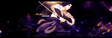
The second one can do with some more blending. Also personally I don't like that much gradiented empty space. The guy's pitching hand is a little weird, over sharpened maybe?
Here's the tut for the 24 one http://img349.imageshack.us/img349/1512/tut4gz.jpg but when following tuts, it never seems to look as good as the tut unless you have the exact same render so I changed a lot of things in it. Also the lighting was really easy because it was so obvious on the render. They also never tell you how to smudge, so that part took forever editing and reediting it to look good.
Edit:


