Digital art design, renderings, signatures and anything art related. Upload pictures of your newest work or ask for feedback. Post graphics requests or discuss art in general.
aazumak
Active Member
Posts: 918 Joined: Sat Jun 09, 2007 12:56 pmQuick Reply: YesLocation: Artist Corner
Contact:
Post
by aazumak Thu Jun 14, 2007 5:20 pm
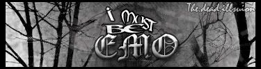
well i decided to make a new sig everyday
plz rate
thnks
AAz
TwelveEleven
Veteran Member
Posts: 3806 Joined: Sat Mar 17, 2007 1:11 amQuick Reply: YesLocation: Heaven
Contact:
Post
by TwelveEleven Thu Jun 14, 2007 5:24 pm
too small imho. And i think you used the same render as in masta's sig, not sure though. (Assasins creed is so cool
)
<<banned from SRF for proof of botting. -SG>>
aazumak
Active Member
Posts: 918 Joined: Sat Jun 09, 2007 12:56 pmQuick Reply: YesLocation: Artist Corner
Contact:
Post
by aazumak Thu Jun 14, 2007 5:30 pm
ah ya^^ it is used in masters
it was on planet renders
Rizla
Ex-Staff
Posts: 1197 Joined: Sun Jun 11, 2006 4:17 amQuick Reply: YesLocation: Artist's Corner
Post
by Rizla Thu Jun 14, 2007 5:53 pm
5.5/10
too small, text needs work, monochromatic, what is the light thing
in the middle of your sig... --- oversharpened, dont know what your focal is.
aazumak
Active Member
Posts: 918 Joined: Sat Jun 09, 2007 12:56 pmQuick Reply: YesLocation: Artist Corner
Contact:
Post
by aazumak Thu Jun 14, 2007 6:08 pm
Rizla wrote: 5.5/10
too small, text needs work, monochromatic, what is the light thing
in the middle of your sig... --- oversharpened, dont know what your focal is.
ok, thnks
i know i need work on text, the light thing just happened and i kept it
but with monochromatic? whats wrong with those colors?
thnks for feedback
Rizla
Ex-Staff
Posts: 1197 Joined: Sun Jun 11, 2006 4:17 amQuick Reply: YesLocation: Artist's Corner
Post
by Rizla Thu Jun 14, 2007 6:23 pm
it looks like you dropped a yellow-green--->green gradient map in on overlay, its monochromatic for the most part. Need a contrasting color.
SuicideGrl
Retired Admin
Posts: 8004 Joined: Fri Jan 27, 2006 4:17 pmLocation: World of Warcraft
Post
by SuicideGrl Fri Jun 15, 2007 1:48 am
aazumak wrote: ah ya^^ it is used in masters
<3 planetrenders.
i agree that it's too small, but i disagree w/ riz that it's oversharpned. i think the crispy edges give it a gritty feel that goes well with your focal. 6/10, mostly for size.
aazumak
Active Member
Posts: 918 Joined: Sat Jun 09, 2007 12:56 pmQuick Reply: YesLocation: Artist Corner
Contact:
Post
by aazumak Sat Jun 16, 2007 2:49 am
by cheap u mean what? cheap can mean many things lol
the.dead.illusion
Regular Member
Posts: 205 Joined: Thu Mar 29, 2007 8:05 amQuick Reply: YesLocation: in the corner
Contact:
Post
by the.dead.illusion Mon Jun 18, 2007 11:12 am
its just that the border color on the left dosnt really look good and it looks abit blurreddddd
Dystopia
Advanced Member
Posts: 2317 Joined: Thu Jan 04, 2007 8:37 pmQuick Reply: YesLocation: Off Topic
Post
by Dystopia Mon Jun 18, 2007 3:01 pm
BOO ON YOUUU, lol jkz
CrimsonNuker
Dom's Slut
Posts: 13791 Joined: Sun Aug 06, 2006 3:31 amQuick Reply: YesLocation: guildwars2
Post
by CrimsonNuker Mon Jun 18, 2007 7:09 pm
Its too small, if it was a good size (about 370~373x120~125) i would give it an 8/10


in the middle of your sig... --- oversharpened, dont know what your focal is.