TGP Postal Services(Dutch company ^^') wnats a new series of stamps. They asked you to make a design for a series of 3 stamps.
They didn't find a good subject themselves yet, so it's up to you which theme belongs to this series of stamps. One must be able to see these stamps belong together, but all 3 of them have to be different.
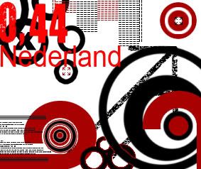
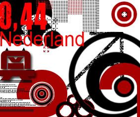
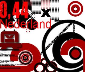
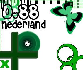
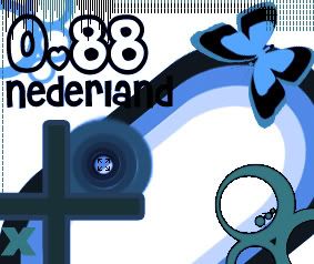
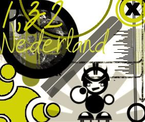
The value( €0,44; €0,88; €1,32) has to be visible, along with the word "Nederland'(Netherlands)
Working Method;
- Collect material as inspiration source for your theme.
- Make 1 or more 'collages'(Is that an english word as well? >.>) with the material you collected
- Collect a few different stamps or images of stamps
- Make a few sketches in which you try several ideas. (Think of the tekst as well)
- Make a choice from your sketches, and work these out to a series of 3 stamps.
What you have to, and may;
- All stamps must have the same size.
- Allignment of characters and numbers on the stamps and size of the text has to be well-considered.
- It's up to you which material you use.
- Stamps have to be presentated 4 times bigger then a real stamp.
- Stamps have to be presentated neatly.(>.<?)
- Sketches of stamps hav to be presentated neatly.
- Collages of the collected material on the theme has to be presentated neatly.
I got no clue where to start. I thought of a more 'modern' theme perhaps music or gaming. Bad thing is, I don't like to sketch. I just want to go. This is the first time I'm afraid I will have to sketch :< Halp?
Wee, first two are here.
[/img]
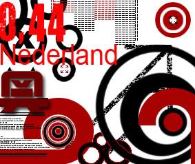
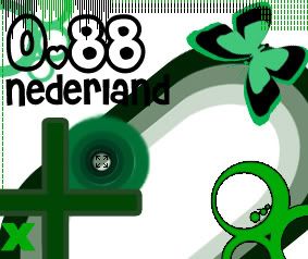
Forgot something
Fix'd empty-ess.. sorta..
Green or Blue?:
And number three :>
Small versions;

2

2²

Green or blue?: