Digital art design, renderings, signatures and anything art related. Upload pictures of your newest work or ask for feedback. Post graphics requests or discuss art in general.
Their is no direction in either signature, this is largely due to the lightning, I dont even know where you want my eyes to start and end, its chaotic.
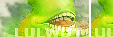
The quality of your top render looks like it was scaled up, a no no for raster images.
Your text is touching the edges, either break the rule intentionally or follow it, you dont want people guessing whether or not you meant to.
Your colors dont blend well, you are using red with a yellow stroke on a blue/black background that has light blue/white highlights (lightning)
Your renders arent feathered well, the edges are rough and I can see distinct pixelation. The stroke on your text is choppy as well.
On a personal level I think lightning is cheesy looking when just dropped in, it seems too much like a stock effect.
The kerning on your text should be adjusted, both your clan tag and name titles have identical kerning (the space between letters) and it looks tacky.
Their is no border/enclosure in a signature that seems fit for it.
I appreciate the comment Rek, I already mod another forum and I get my fair share of crap to deal with, SRF is becoming my anonymous haven. I have never, and will never play SRO -- I just liked some of the art from the game and figured the community had to have some good talent in it...whaddya know, I was right