Digital art design, renderings, signatures and anything art related. Upload pictures of your newest work or ask for feedback. Post graphics requests or discuss art in general.
rek
Ex-Staff
Posts: 5607 Joined: Sun Dec 31, 2006 10:46 amQuick Reply: YesLocation: darkroot garden
Contact:
Post
by rek Tue May 08, 2007 1:27 pm
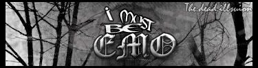
advice and -/10 please
<3
0len
Priam
Forum Legend
Posts: 7885 Joined: Tue Jul 11, 2006 8:38 amQuick Reply: YesLocation: At the apple store, Cause i'm an iAddict.
Post
by Priam Tue May 08, 2007 1:55 pm
Not one of you're normal level of skill imo, the render doesn't at all look like it's meant to be there.
cin
Post
by cin Tue May 08, 2007 2:20 pm
Priam wrote: Not one of you're normal level of skill imo, the render doesn't at all look like it's meant to be there.
+1. background very nice; 8,5/10
but the render doesnt fit >_< try putting an other one in
CrimsonNuker
Dom's Slut
Posts: 13791 Joined: Sun Aug 06, 2006 3:31 amQuick Reply: YesLocation: guildwars2
Post
by CrimsonNuker Tue May 08, 2007 7:10 pm
usually i see sharpening effects on sprite sigs..
Rockshmo
Frequent Member
Posts: 1062 Joined: Mon May 29, 2006 5:00 pmQuick Reply: YesLocation: rehab
Contact:
Post
by Rockshmo Tue May 08, 2007 7:12 pm
Big white half border looks stupid.. lens flare, circles, and lines.. not much attraction in it.. 3/10
[Sparta][Pure STR][Lvl 5x]
ElCapuccino
Frequent Member
Posts: 1122 Joined: Tue Sep 12, 2006 4:04 pm
Post
by ElCapuccino Tue May 08, 2007 7:43 pm
BOOO for the big white border.
<<banned from SRF got bot admission and illegal activities. -SG>>
PureOwnage
Frequent Member
Posts: 1104 Joined: Thu Jun 01, 2006 6:54 pm
Post
by PureOwnage Wed May 09, 2007 3:41 am
3/10, wtf happend Rek? Experimentation or something? The render looks totally out of place as many have said, also the randomness of the BG also adds to the lacking of the sig. Try to make the colors and the render complement eachother.
<<banned from SRF for rules violations. -SG>>
rek
Ex-Staff
Posts: 5607 Joined: Sun Dec 31, 2006 10:46 amQuick Reply: YesLocation: darkroot garden
Contact:
Post
by rek Wed May 09, 2007 6:11 am
lol the white bit was supposed to b transparent -___-" i dont preview posts. And mehh
<3
0len
0l3n
Elite Member
Posts: 5184 Joined: Fri Jun 16, 2006 1:45 pmQuick Reply: YesLocation: Artists Corner
Post
by 0l3n Wed May 09, 2007 6:49 pm
Am I the only one who likes the white border?
CrimsonNuker
Dom's Slut
Posts: 13791 Joined: Sun Aug 06, 2006 3:31 amQuick Reply: YesLocation: guildwars2
Post
by CrimsonNuker Wed May 09, 2007 7:37 pm
0l3n wrote: Am I the only one who likes the white border?sharpening a bit .
+1
maybe the big white border would look much better on a black forum
the.dead.illusion
Regular Member
Posts: 205 Joined: Thu Mar 29, 2007 8:05 amQuick Reply: YesLocation: in the corner
Contact:
Post
by the.dead.illusion Thu May 10, 2007 6:40 am
the white borders ment to be transparant so the text stick out of the sig
Geedunk
Active Member
Posts: 787 Joined: Sat Jan 13, 2007 3:30 pm
Post
by Geedunk Sat May 12, 2007 11:36 am
Ok, this one is hard to save (no offense):
XxYODAxX wrote: Thank you Geedunk you are friggin awesome!
RuYi wrote: Geedunk for president!!