Calvin and/or just Hobbes prefered orange colors or anything that'll look nice and go with a nice looking render. 375 x 100 or something close to that, thanks in advance
I wants a new siggy :)
-
Luoma
- Veteran Member
- Posts: 3895
- Joined: Thu Sep 14, 2006 8:23 am
- Quick Reply: Yes
- Location: Artists Corner & Aege
I wants a new siggy :)
I think iv'e asked only once before..  Could someone make me a nice sig?
Calvin and/or just Hobbes prefered orange colors or anything that'll look nice and go with a nice looking render. 375 x 100 or something close to that, thanks in advance
Calvin and/or just Hobbes prefered orange colors or anything that'll look nice and go with a nice looking render. 375 x 100 or something close to that, thanks in advance
<<banned from SRF for proof of botting. -SG>>
-
Quyxz

- Advanced Member
- Posts: 2364
- Joined: Tue Apr 11, 2006 4:47 pm
- Quick Reply: Yes
- Location: The Netherlands
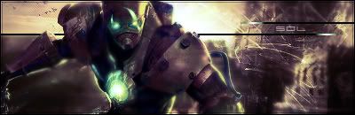
I finished it. I quitted kinda fast, because I didn't like the stock very much. 

Here you go.
Edit: lol, I notice it's exact the same stock as u has as avatar. xD
Code: Select all
[IMG]http://i19.tinypic.com/4iepac0.jpg[/IMG]Here you go.
Edit: lol, I notice it's exact the same stock as u has as avatar. xD
One oldskool matherfacker

-
Fracture

- Valued Member
- Posts: 391
- Joined: Sat Mar 04, 2006 4:59 pm
- Quick Reply: Yes
- Location: Pacific
Snudge wrote:Nice sig, but the font could do a different color
A couple people on these forums started giving out tutorials but no one ever taught anyone how to actually use text/font decorations, so 90% of these forums spend all their time mixing 'C4D' and 'Renders' (even though both of these concepts are completely wrong) to make so-so graphics, then tag on a horrible text-line in order to compliment the owner/designer.
It's a sad facet of SRO artists corner.

ArchLord | Fracture | 32 | MoonElf Ranger | notFALLIN
SilkRoad | Sunstyle | 42 | Str Fire Glaive | SuddenDeath (Retired for now)
-
Snudge
- Senior Member
- Posts: 4200
- Joined: Sun Jun 11, 2006 8:20 pm
- Quick Reply: Yes
- Location: Artist Corner
- Contact:
Fracture wrote:Snudge wrote:Nice sig, but the font could do a different color
A couple people on these forums started giving out tutorials but no one ever taught anyone how to actually use text/font decorations, so 90% of these forums spend all their time mixing 'C4D' and 'Renders' (even though both of these concepts are completely wrong) to make so-so graphics, then tag on a horrible text-line in order to compliment the owner/designer.
It's a sad facet of SRO artists corner.
Nicely stated, and /agreed.
<<banned from SRF for proof of botting. -SG>>
-
Fracture
- Valued Member
- Posts: 391
- Joined: Sat Mar 04, 2006 4:59 pm
- Quick Reply: Yes
- Location: Pacific
Snudge wrote:Nicely stated, and /agreed.
My main peeve is that a render is when 'you' create something original, and it is represented in a 3D environment. The term predates 3D Studio Max, where you would 'render' an object after you finished designing it. It by no means is defined, anywhere, as the act of 'cutting out' a picture, or any sort of 2D object.
I learned photoshop from text on up, not the other way around, and grunge brushes get really old after maybe 1-2 pieces of work.
ArchLord | Fracture | 32 | MoonElf Ranger | notFALLIN
SilkRoad | Sunstyle | 42 | Str Fire Glaive | SuddenDeath (Retired for now)
-
Luoma
- Veteran Member
- Posts: 3895
- Joined: Thu Sep 14, 2006 8:23 am
- Quick Reply: Yes
- Location: Artists Corner & Aege
Quyxz wrote:I finished it. I quitted kinda fast, because I didn't like the stock very much.Code: Select all
[IMG]http://i19.tinypic.com/4iepac0.jpg[/IMG]
Here you go.
Edit: lol, I notice it's exact the same stock as u has as avatar. xD
thanks man
<<banned from SRF for proof of botting. -SG>>
-
Sol

- Regular Member
- Posts: 321
- Joined: Tue Jan 30, 2007 9:21 am
- Quick Reply: Yes
- Location: Sparta
- Contact:
best tuts are those that incorporate the blending of the background to accept the text you have in mind. like afew of cokes classics, he occasionally builds up the background to help improve his text.
dunno if that made sense, been away from my computer like a month so i can´t remember the terms for graphics and making and sh!t, lol (tripping over my tongue)
sol
dunno if that made sense, been away from my computer like a month so i can´t remember the terms for graphics and making and sh!t, lol (tripping over my tongue)
sol

-
[SD]happynoobing

- Advanced Member
- Posts: 2349
- Joined: Thu Jan 04, 2007 2:06 am
- Quick Reply: Yes
- Location: Off Topic