Digital art design, renderings, signatures and anything art related. Upload pictures of your newest work or ask for feedback. Post graphics requests or discuss art in general.
DPTR
Casual Member
Posts: 65 Joined: Fri Mar 24, 2006 4:47 pmQuick Reply: YesLocation: Xian
Post
by DPTR Thu Apr 20, 2006 11:27 am
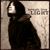
This is the first version of my new sig. Any advice or criticism is welcome.
Tainted
Valued Member
Posts: 478 Joined: Mon Apr 03, 2006 9:17 pmQuick Reply: YesLocation: Ares
Post
by Tainted Thu Apr 20, 2006 12:18 pm
Needs less clothes.. j/k
Starting Fresh.
DPTR
Casual Member
Posts: 65 Joined: Fri Mar 24, 2006 4:47 pmQuick Reply: YesLocation: Xian
Post
by DPTR Thu Apr 20, 2006 2:16 pm
Tainted wrote: Needs less clothes.. j/k
LoL... this literally made me laugh out loud!
Nannari
Regular Member
Posts: 323 Joined: Sun Apr 16, 2006 4:28 pmQuick Reply: YesLocation: Odin
Post
by Nannari Thu Apr 20, 2006 2:24 pm
maybe a little border? Nice screenshot though.. and i like those shiny dotish-thingys..
dom wrote: I never use more then 20~gb, and most of that is in porn alone.
DPTR
Casual Member
Posts: 65 Joined: Fri Mar 24, 2006 4:47 pmQuick Reply: YesLocation: Xian
Post
by DPTR Thu Apr 20, 2006 4:24 pm
Nannari wrote: maybe a little border? Nice screenshot though.. and i like those shiny dotish-thingys..
They're supposed to be fire flies.... I like the border idea though
Nannari
Regular Member
Posts: 323 Joined: Sun Apr 16, 2006 4:28 pmQuick Reply: YesLocation: Odin
Post
by Nannari Thu Apr 20, 2006 4:54 pm
DPTR wrote: Nannari wrote: maybe a little border? Nice screenshot though.. and i like those shiny dotish-thingys..
They're supposed to be fire flies.... I like the border idea though
Yeah, i figured that out at second glance
Didn't really pay attention to the FireFly guildmark you had there! ;D
A good border can enhance any sig.. Or.. So i've heard <.<
dom wrote: I never use more then 20~gb, and most of that is in porn alone.
crak3d
Hi, I'm New Here
Posts: 8 Joined: Sun Apr 09, 2006 6:06 pmQuick Reply: YesLocation: Babel
Contact:
Post
by crak3d Fri Apr 21, 2006 8:03 pm
Work on your text. Don't fade the DPTR part... never fade white text it looks terrible =P
||Fear|| - lvl 22 Fire/Lightning Blade
Statix
New Member
Posts: 25 Joined: Sat Apr 22, 2006 12:40 amQuick Reply: YesLocation: England
Post
by Statix Sat Apr 22, 2006 10:39 am
Not bad Not Bad.
SoldjahBoy
Casual Member
Posts: 87 Joined: Wed Apr 12, 2006 11:58 pmQuick Reply: YesLocation: Athens
Contact:
Post
by SoldjahBoy Sun Apr 23, 2006 3:48 am
i like it as well, but yeah, a border would really bring it out a bit more.... even if its a simple single lined rectangle border
and ignore the comment about "never fade white text it looks horrible" becuase IMO faded white text in the right areas, can be quite effective... i, and many other professionally produced products agree.
antix
Loyal Member
Posts: 1608 Joined: Sun Apr 16, 2006 11:18 pmQuick Reply: YesLocation: Troy
Contact:
Post
by antix Mon Apr 24, 2006 10:47 pm
Nice SS, But I would say to get new text effects, they kinda make me cry.
This is a game, You're invited.
www.lost.eu/572c4
redneck wrote: Holy crap how do u drop 1 gold piece?
naljamees51
Frequent Member
Posts: 1054 Joined: Tue Mar 21, 2006 1:34 pmQuick Reply: YesLocation: Estonia
Post
by naljamees51 Thu Apr 27, 2006 5:22 am
ITS MADE WERYWERY EASELY
lol
I'm gay, lets cry.