Digital art design, renderings, signatures and anything art related. Upload pictures of your newest work or ask for feedback. Post graphics requests or discuss art in general.
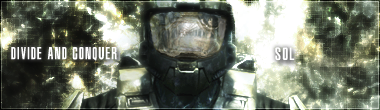
Its okay, it would look better if the texts (your name and Divide and Conquer)
IMO it would look much much better if ur name was like big, but not too big and ur sub sentence is right under it and its really small, just small enough to read
CrimsonNuker wrote:Its okay, it would look better if the texts (your name and Divide and Conquer)
IMO it would look much much better if ur name was like big, but not too big and ur sub sentence is right under it and its really small, just small enough to read
there reason is separate is because i didn't want one side to seem emptier. also i did try it in different sizes but i found that just 1size up and inline with D&C was good so i left it at that.