Animation sig + New sig

Digital art design, renderings, signatures and anything art related. Upload pictures of your newest work or ask for feedback. Post graphics requests or discuss art in general.
Post Reply
User avatar
Sparks
New Member
Posts: 26
Joined: Wed Feb 14, 2007 9:15 am
Quick Reply: Yes
Location: Wollongong, Australia
Contact:

Animation sig + New sig

Post by Sparks »

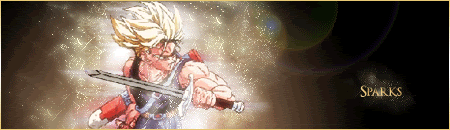
*New sig - scroll down*
Just made a new sig, I think it's my best.
And it's my first time putting animation in a picture, even though it's minor.
Just wish the render could've been a bit better :banghead:
Image
Ratings, comments and suggestions appreciated.
Last edited by Sparks on Tue Mar 13, 2007 9:12 am, edited 1 time in total.
Image

User avatar
Dorlingz
Regular Member
Posts: 203
Joined: Thu Oct 26, 2006 9:30 am
Quick Reply: Yes
Location: Australia
Contact:

Post by Dorlingz »

8) Smarty.

Trunks is teh sex.

Oi Sparks I found out that Waples is on long service, and that's why we're getting new teachers.
Image
5m0k3 wrote:r tards

User avatar
Sparks
New Member
Posts: 26
Joined: Wed Feb 14, 2007 9:15 am
Quick Reply: Yes
Location: Wollongong, Australia
Contact:

Post by Sparks »

Yeah Doug told me about that.
And I've just realised that I went a bit overboard on the motion blur. When I get 'round to it, I'll lower the opacity or change the layer style.
Image

User avatar
naljamees51
Frequent Member
Posts: 1054
Joined: Tue Mar 21, 2006 1:34 pm
Quick Reply: Yes
Location: Estonia

Post by naljamees51 »

well...i think its nice for ur first animation :roll: <<<imo>>>
i dunno is it good or bad...because i have newer made any animations :D
but i think its nice :)
Image


I'm gay, lets cry.

Geedunk
Active Member
Posts: 787
Joined: Sat Jan 13, 2007 3:30 pm

Post by Geedunk »

The render is blurred and the blue dot is.. Weird..

I don't like animationsigs either, but nice anyways.
Image
XxYODAxX wrote:Thank you Geedunk you are friggin awesome!

RuYi wrote:Geedunk for president!! :D

User avatar
Sparks
New Member
Posts: 26
Joined: Wed Feb 14, 2007 9:15 am
Quick Reply: Yes
Location: Wollongong, Australia
Contact:

Post by Sparks »

Yeah I wish a had a better render of that pic. And yeah haha, the blue dot is just from the lens flare, just noticed that.
Image

User avatar
Sparks
New Member
Posts: 26
Joined: Wed Feb 14, 2007 9:15 am
Quick Reply: Yes
Location: Wollongong, Australia
Contact:

Post by Sparks »

Rather than make a new topic I thought I'd post my new sig here -
Image

Image

I think I cut out a bit too much with the pop-out one. :roll:
EDIT - Fixed the pop-out.
Last edited by Sparks on Wed Mar 14, 2007 3:40 am, edited 1 time in total.
Image

User avatar
0l3n
Elite Member
Posts: 5184
Joined: Fri Jun 16, 2006 1:45 pm
Quick Reply: Yes
Location: Artists Corner

Post by 0l3n »

The new one is way better but you cut his hair of in the pop-out.
Image
Image

ElCapuccino
Frequent Member
Posts: 1122
Joined: Tue Sep 12, 2006 4:04 pm

Post by ElCapuccino »

pop-outs are bad! u'll get cancer from them!
<<banned from SRF got bot admission and illegal activities. -SG>>

User avatar
naljamees51
Frequent Member
Posts: 1054
Joined: Tue Mar 21, 2006 1:34 pm
Quick Reply: Yes
Location: Estonia

Post by naljamees51 »

yea...the new sig is much better...
but the pop-up thing makes it look weird ...

but the one what don't have the pop-up part is OK :)
Image


I'm gay, lets cry.

User avatar
Sparks
New Member
Posts: 26
Joined: Wed Feb 14, 2007 9:15 am
Quick Reply: Yes
Location: Wollongong, Australia
Contact:

Post by Sparks »

ElCapuccino wrote:pop-outs are bad! u'll get cancer from them!

I'm feeling it already.
Image

User avatar
CrimsonNuker
Dom's Slut
Posts: 13791
Joined: Sun Aug 06, 2006 3:31 am
Quick Reply: Yes
Location: guildwars2

Post by CrimsonNuker »

pop out= you can blend ur render proprly, the new one is much better than the old one
ImageImageImage

Post Reply

Return to “Artists Corner”