Digital art design, renderings, signatures and anything art related. Upload pictures of your newest work or ask for feedback. Post graphics requests or discuss art in general.
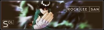
I don't think the render fits, but recently i've been trying to do sigs without look up a tut and see how to do the settings. This was my second attempt Without help on it.
To the main point. i need your opinions does the render fit
I think that you should make the background a little more bright. That render is hard to use imo.. hehe I tried that one yesterday but just couldn't make it fit .im not a pro by any means so take it how you will.
lol ol3n hit it on the head. originally i used a bright render but it got messed up in the color balence so i took it out and tried many other renders i didn't want to not use the background cuz i rly liked it. so i got lee (cuz he's top fav char with hinata ) and up him in. it was hard to blend him. i agree about the size but i wanted to see certain parts of him that just wouldn't fit in any other way. but ty for feedback
The problem is not the render... is the background. U need some kind of effect to destroy theat over softness. Try with some grunge brushs or so.
And try to change a bit the colors.
The rest i think its fine...
yes, the boxes around " ROCK LEE SAN " are abit to bright i should have lowered the opacity.
i think the problem was that his isn't big enough on the sig Height is ok but Width is a problem. i don't want ppl to think that he's fat cuz he's got the best hand to hand combat skills ever. and is lightning fast just watch his fight versus that bone guy. lol drunken brawler!


