New sig - too bright?

Digital art design, renderings, signatures and anything art related. Upload pictures of your newest work or ask for feedback. Post graphics requests or discuss art in general.
Post Reply
Berdi
Common Member
Posts: 115
Joined: Sat Sep 23, 2006 8:05 pm
Quick Reply: Yes
Location: Olympus

New sig - too bright?

Post by Berdi »

Image

Since valentines day is over, I've tried to create a new sig.

However, I'm not that pleased with it. I think its mainly the light.
Image

berdi, did you just got owned again?

User avatar
naljamees51
Frequent Member
Posts: 1054
Joined: Tue Mar 21, 2006 1:34 pm
Quick Reply: Yes
Location: Estonia

Post by naljamees51 »

its nice...
but yeah...maby litl yoo bright ...
if u wold make an border and just make it litl darker the it wold be really nice sig :P
Image


I'm gay, lets cry.

User avatar
RuYi
Ex-Staff
Posts: 7145
Joined: Tue Apr 25, 2006 7:39 am
Location: Done.

Post by RuYi »

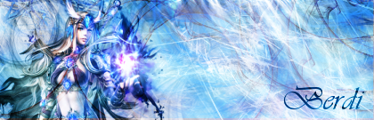
I like it, the light doesn't really bother me, but if you don't like it, darken it and then compare it with the light version and see which one you like best. :)
Image

User avatar
0l3n
Elite Member
Posts: 5184
Joined: Fri Jun 16, 2006 1:45 pm
Quick Reply: Yes
Location: Artists Corner

Post by 0l3n »

Yeah, I don't think the lighting is bad at all.
Image
Image

User avatar
[SD]happynoobing
Advanced Member
Posts: 2349
Joined: Thu Jan 04, 2007 2:06 am
Quick Reply: Yes
Location: Off Topic

Post by [SD]happynoobing »

i like it, i like its shinyness. :D
Image

User avatar
Dorlingz
Regular Member
Posts: 203
Joined: Thu Oct 26, 2006 9:30 am
Quick Reply: Yes
Location: Australia
Contact:

Post by Dorlingz »

Filter>Render>Lighting Effects

Muck around with that.
Image
5m0k3 wrote:r tards

User avatar
CrimsonNuker
Dom's Slut
Posts: 13791
Joined: Sun Aug 06, 2006 3:31 am
Quick Reply: Yes
Location: guildwars2

Post by CrimsonNuker »

you remind of myself when i was starting out to make sigs, i would always overbrush with the prawnzor abstract brushes

if your worryed it might be too bright, start off with a black canvas then brush in white then play around with the brightness/contrast settings (Brightness+/Contrast-)

P.S: i had to look really really close to see the really transparent border lol (light borders are not good with this forum)
ImageImageImage

User avatar
0l3n
Elite Member
Posts: 5184
Joined: Fri Jun 16, 2006 1:45 pm
Quick Reply: Yes
Location: Artists Corner

Post by 0l3n »

Lol, I didnt even see it before :P
Image
Image

Luoma
Veteran Member
Posts: 3895
Joined: Thu Sep 14, 2006 8:23 am
Quick Reply: Yes
Location: Artists Corner & Aege

Post by Luoma »

not too bright imo, but it needs a border and maby its a teeny weeny big.
Looks very good :)
<<banned from SRF for proof of botting. -SG>>

User avatar
0l3n
Elite Member
Posts: 5184
Joined: Fri Jun 16, 2006 1:45 pm
Quick Reply: Yes
Location: Artists Corner

Post by 0l3n »

Offtopic: The Sweden elites.

And yeah add a border and maby a little contrast.
Image
Image

Post Reply

Return to “Artists Corner”