Another First Siggy

Digital art design, renderings, signatures and anything art related. Upload pictures of your newest work or ask for feedback. Post graphics requests or discuss art in general.
Post Reply
User avatar
[SD]MARKsman7328
Valued Member
Posts: 353
Joined: Fri Jun 30, 2006 8:59 pm
Quick Reply: Yes
Location: Xian
Contact:

Another First Siggy

Post by [SD]MARKsman7328 »

O.K. Here is my first siggy:
Image

plz do comment (not too too harshly plz) and give me some suggestions (i know there will be many)
Image
Phoenix - Mark
ex-Iris. Hybrid Bow - dydx
ex-Venus: BHA:SD Wizard GreatGatsby
ex-Xian character: MARKsman7328

User avatar
fireandice25
Casual Member
Posts: 89
Joined: Mon Jul 24, 2006 9:18 pm
Quick Reply: Yes
Location: Olympus
Contact:

Post by fireandice25 »

Dude nice sig. Not bad at all and keep up the good work. 8)
KSRO/Character-Halcyon/LVL-7/Server x3x
ISRO/Character-Halycon/LVL-18/Server Olympus
Image
Image

User avatar
satman83
Site Contributor
Posts: 9541
Joined: Tue Oct 31, 2006 9:54 pm
Quick Reply: Yes
Location: London
Contact:

Post by satman83 »

Well

personaly i dont like it....sorry but the area west of DW brings up
bad memories for me....lol but seriously it is a good first attempte.
Image

0oKeikoo0
Active Member
Posts: 544
Joined: Thu Sep 28, 2006 11:21 pm

Post by 0oKeikoo0 »

all the animation gets me dizzy :(
<<banned from SRF for bot admission. -SG>>

User avatar
Draquish
Elite Member
Posts: 6423
Joined: Wed Mar 15, 2006 10:25 pm
Quick Reply: Yes
Location: ____

Post by Draquish »

make it smaller
Get new text
Make a border
Animation kinda empty, play with it :wink:
Brush it up a lil


Nice rendering.Nice animation for a beginner :)

What program do you use?

User avatar
CrimsonNuker
Dom's Slut
Posts: 13791
Joined: Sun Aug 06, 2006 3:31 am
Quick Reply: Yes
Location: guildwars2

Post by CrimsonNuker »

Awsome! it looks like you put a lot of time in it, but theres one flaw

are you gonna edit the sig everytime you level up?
ImageImageImage

User avatar
[SD]MARKsman7328
Valued Member
Posts: 353
Joined: Fri Jun 30, 2006 8:59 pm
Quick Reply: Yes
Location: Xian
Contact:

Post by [SD]MARKsman7328 »

draquish wrote:make it smaller
Get new text
Make a border
Animation kinda empty, play with it :wink:
Brush it up a lil


Nice rendering.Nice animation for a beginner :)

What program do you use?

ty draq :)
yes, i thought it should be smaller too once i saw how big it was compared to others. border=good idea. i like my papyrus text, but w/e. ya the animation is all the same, i could spruce that up quite a bit. overall, good suggestions and ty. (photoshop cs2 and imageready cs2 ftw)

CrimsonNuker wrote:Awsome! it looks like you put a lot of time in it, but theres one flaw

are you gonna edit the sig everytime you level up?

luckily (since i used photoshop cs2) updating it should be no problem. i put the text each in separate layers so all i have to do is go in and edit the text and then re-render it an viola!
Image
Phoenix - Mark
ex-Iris. Hybrid Bow - dydx
ex-Venus: BHA:SD Wizard GreatGatsby
ex-Xian character: MARKsman7328

User avatar
aibakaneko
Casual Member
Posts: 57
Joined: Fri Nov 24, 2006 10:53 am
Quick Reply: Yes
Location: Oasis
Contact:

Post by aibakaneko »

hm... nice concepts and all.. but it kinda disturb me a little... it's too crowed...

what do you want the viewer to see? cuz right all.. all i can see are the texts... and the texts looks disturbing.. can't really tell why.. it makes me want to look away... .. maybe it's font choice... color choice... or both.. :roll: other than that.. it's pretty cool. :D
こんにちわ! わたしわ あすからです! どぞぞろしくします!

きゃあああああ!*Glomps*
Image

User avatar
[SD]MARKsman7328
Valued Member
Posts: 353
Joined: Fri Jun 30, 2006 8:59 pm
Quick Reply: Yes
Location: Xian
Contact:

Post by [SD]MARKsman7328 »

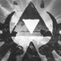
aibakaneko wrote:hm... nice concepts and all.. but it kinda disturb me a little... it's too crowed...

what do you want the viewer to see? cuz right all.. all i can see are the texts... and the texts looks disturbing.. can't really tell why.. it makes me want to look away... .. maybe it's font choice... color choice... or both.. :roll: other than that.. it's pretty cool. :D


thats what i been thinkin, u just put it into words. i think its too many colors and animation and stuff. its like when noobs use the big exploding animation in powerpoint. i think i need to make it more subtle.
Image
Phoenix - Mark
ex-Iris. Hybrid Bow - dydx
ex-Venus: BHA:SD Wizard GreatGatsby
ex-Xian character: MARKsman7328

Post Reply

Return to “Artists Corner”