Digital art design, renderings, signatures and anything art related. Upload pictures of your newest work or ask for feedback. Post graphics requests or discuss art in general.
Kamoflage wrote:O.o I like it but why is everyone making pop-out sigs all of a sudden ? Why are they so appealing ??
I started a trend?
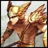
Dunno, but I like doing pop-outs, as long as it isn't too bad. In this case, I didn't want to cut off her wings, but I didn't want to lower her any further
Looks like you saved the file wrong.. the wings look scetchy, or you cut it like that. Anyways good job, told you there were some good pop-up sigs out there.
Caras wrote:Looks like you saved the file wrong.. the wings look scetchy, or you cut it like that. Anyways good job, told you there were some good pop-up sigs out there.
saved it as a gif for a change, when I get home or tomorrow, i'll save it as a png, and then it should be so choppy
I like big...for me the small doesn't do much. I have had small before:
And no, I didnt make it, it was made for me about 2 yrs ago
This one is a 'friend' of mine. He's a lot like you Chaud, arrogant in his beliefs, but knows what he is talking about. And is a walking asshole. But I just had to save this siggie of his.
LOL! I love that one, and I actually know what its about To bad you didn't pick an alchemist though I love your new sig, the pop-out isn't extreme, but very subtle, and I like it =D 8.5/10
Snudge wrote:LOL! I love that one, and I actually know what its about To bad you didn't pick an alchemist though I love your new sig, the pop-out isn't extreme, but very subtle, and I like it =D 8.5/10
I do have an alchy, but that one my friend did, I was showing it as an example of "poking" out
Well, if you ask me it doesn't seem totally necessary for that to be a pop-out. The ends of the wings aren't really worthy of being seperate and visible. Kinda a waste of space in that sense.
Reise wrote:Well, if you ask me it doesn't seem totally necessary for that to be a pop-out. The ends of the wings aren't really worthy of being seperate and visible. Kinda a waste of space in that sense.
Other than that it looks great.
Well I am going to Toronto in about 15 mins, so I won't be home until late tonight, so when I get home, I will trim them and see how much of a difference it makes, then go from there.
It's ok.
I think its too big, and the popout with only the wings seems pointless.
I dont really like the pure blue, as its a bit too... eh... blue..? for my taste.
I guess its fine though, far far far from the worst that has been posted here on the site, but its also quite far from the best.
I like your avatar ALOT better.. pink pink pink <3
dom wrote: I never use more then 20~gb, and most of that is in porn alone.