Digital art design, renderings, signatures and anything art related. Upload pictures of your newest work or ask for feedback. Post graphics requests or discuss art in general.
-it's too dark to see anything. -this is not an appropriate size for a sig. -lightings shouldn't be different on that character and background, try to blend them together -don't get rushed and give yourself more time to make something better -it's not about how much did you do, sometimes simple ideas can be good too -don't try to modify this, better to make another one -take a look at others' designs and find your inspiration there, and don't copy an idea .. make yours
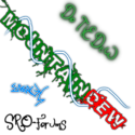
MountainDew wrote::banghead: Help me make it better suggestions critics are verywelcome
Spoiler!
Main problem is the lighting. Notice how Ironhide is really dark while the background has its own lighting. To solve this use Dodge/Burn to play with the Lighting.
Don't look at the individual techniques of those tutorials, rather look at the way the the sigs are laid out. the background is no where near as important as the focal, in this case the Transformer. There is very little that your particular background adds that we cant figure out from the focal to begin with so it is not necessary to have such a detailed and large background.


Help me make it better
suggestions critics are very welcome
Spoiler!


 bumpz
bumpz 