Digital art design, renderings, signatures and anything art related. Upload pictures of your newest work or ask for feedback. Post graphics requests or discuss art in general.
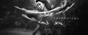
TheKnight wrote:Looks Great but I think backround doesn't fit in there, The name is Technology and backround looks like a jungle, but what effects u used on the text?
Inner glow, outer glow, gradient map, drop shadow(in soft light blending mode). Background suposed to be like that, because it's like a technology + nature. That was the idea. Whored almost all this c4d. It's the only c4d that used here.
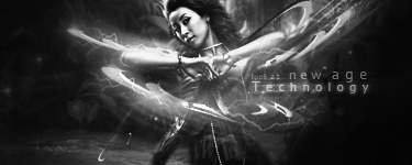
I say it looks pretty solid. Nice atmosphere, but lacks effects, that is more elements in it. Only add more details and it will be even nicer, keep it up (and remove the text, or make it good)
Melez wrote:I say it looks pretty solid. Nice atmosphere, but lacks effects, that is more elements in it. Only add more details and it will be even nicer, keep it up (and remove the text, or make it good)
Thanx, im working of improvement, even got few ideas (adding some lightining on c4d to make it look more "mechaninc", add robotic hand, add red-eye and ofcourse fix the text). Thanks for comment Melez
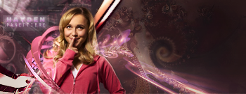
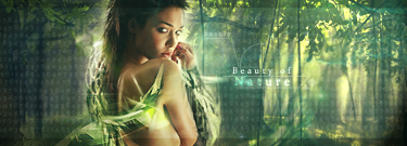
Pretty neat work. I like the Hayden sig a lot. Everything blends perfectly. The Nature sig is nice as well but it looks more like a magazine ad to me instead of a sig. Maybe that's just me though.
you can do some pretty nice things to you focal point but everything else just seems pretty bland. Try, as stated b4 prolly (too lazy to read) to add some more effects and to touch of up flow and depth as some of ur sigs just seem like render/focal and thats it :] your getting better tho kiu
edit: the hayden one looks pretty good but the colours could do some fixing to make it stand out more as most of the far left colours are dull
These sigs (starting with Technology) were made after like month and the half break. After I saw kraQ's message at Sig wars (Redo sigs) i though i can make much better old ones. Well and Beauty of Nature idea was born after i saw movie "The Year One". Haydete was random 30 mins of work. Thanks for commentZ
Noobs_Slayer wrote:new one: took me about 5hours, Farking baztard
not a big fan of the HS girl anime genre but my first impression is that the blue killed it. It's fine the way it is and I can't really imagine another background that would work for it right now (that I'm still half-asleep) but I suppose the blue's alright.
8/10 Don't mean to be an ass but there's this rigid thick line on the left side of the cloud that just acts like a magnet, drawing my eyes to it everytime I see the sig.