Digital art design, renderings, signatures and anything art related. Upload pictures of your newest work or ask for feedback. Post graphics requests or discuss art in general.
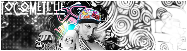
don't really like it =/ the person doesn't seem to fit quite well with the background or is placed at the wrong spot. 2nd version seems a little better though
on the first one you should change the green on the left to something else, blue would seem best.
Day[9] wrote:"Tea is a lot like gold expansions - it helps you kill people." - Day[9] Daily 337 -
About few days ago I was thinking where the hell is Ol3n and his awesome sigs. I'm glad you are back.
OnT: I like the B&W more too. Looks pretty good and unique I give you that much but I think the backroung could be little more simple. It's stealing the attention from focal. Also the light blue light spot on the right side of her face is maybe too powerful. I still like the colors. Also I the penguin.
Thanks for the feedback guys, was thinking of making the entire backround look like the right side but kinda got bored at the end.
And I just noticed I posted the wrong ones, no biggie though, the other ones were just made to enhance the focalpoint more. I agree on the light dots to the right, need to be toned down.
What's that gas-mask Bioshock-ey girl doing behind the focal? Nice sig, the overall flashy look is what saves this tag. Still, feeling rusty. keep it up!