Digital art design, renderings, signatures and anything art related. Upload pictures of your newest work or ask for feedback. Post graphics requests or discuss art in general.
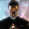
Well Kraq, it is a nice work of yours (love vectoring), but unfortunatelly not all of the collors matches toggeter. You should have used lower opacity brush on circle shape it would look much nicier (the only brush i ment was on the very ending of the left) Now distortion, I do not like that, in my oppinion it would have looked nicier without it. Next thing i didn't liked was yellow effect that covering render, it should have been smaller. I hope i don't get flamed for saying MY OPPINION, these are just minor mistakes that i see, though im a just a newb. Whole work looks awesome, just like the rest.


