(before anyone points it out, I said "meself" on purpose)
NSR
- Crowley
- Global Moderator

- Posts: 4926
- Joined: Sun Jan 27, 2008 10:30 pm
- Location: Auckland, New Zealand
NSR
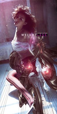
What do you guys think of my current sig? Made it meself quite some time ago, when I was still into photo shopping. I know text is not all that great but then again I suck at text.
(before anyone points it out, I said "meself" on purpose)
(before anyone points it out, I said "meself" on purpose)

- Noobs_Slayer
- Frequent Member
- Posts: 1196
- Joined: Fri Jan 18, 2008 10:56 am
- Location: AioN
Re: NSR
Well, i think i could not give high scrore because:
I don't see deepth, It is too bright, no effects and flow.
I don't see deepth, It is too bright, no effects and flow.
- woutR
- Elite Member
- Posts: 5573
- Joined: Wed Feb 08, 2006 5:20 pm
- Quick Reply: Yes
- Location: Netherlands
- Contact:
Re: NSR
I like how you worked with the colors, nice fading and I think it's a nice transition to the white, but I don't like the render or whatever you call it. I don't like that it's in the center and I don't like cartoons.
The text looks ugly and too blurry. Can't say I like the lines where the text is in either.
The transition to white with the white smudges looks nice.
But I'm just an amateur with amateur opinion. Photoshop will never be for me
The text looks ugly and too blurry. Can't say I like the lines where the text is in either.
The transition to white with the white smudges looks nice.
But I'm just an amateur with amateur opinion. Photoshop will never be for me

<<
- Crowley
- Global Moderator

- Posts: 4926
- Joined: Sun Jan 27, 2008 10:30 pm
- Location: Auckland, New Zealand
Re: NSR
woutR wrote:I like how you worked with the colors, nice fading and I think it's a nice transition to the white, but I don't like the render or whatever you call it. I don't like that it's in the center and I don't like cartoons.
The text looks ugly and too blurry. Can't say I like the lines where the text is in either.
The transition to white with the white smudges looks nice.
But I'm just an amateur with amateur opinion. Photoshop will never be for me
Thanks a lot, I agree with the text. I think I'll remove it (if I can find my psd)
Noobs_Slayer wrote:Well, i think i could not give high scrore because:
I don't see deepth, It is too bright, no effects and flow.
Well, I'm no pro

