
My First Sig
-
Morgoth
- Active Member
- Posts: 854
- Joined: Tue Feb 21, 2006 11:33 pm
- Quick Reply: Yes
- Location: Off Topic
My First Sig
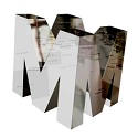
what do you guys think. give me your opinions and suggestion and how to do them cause im not much of an expert w/ ps 


The text is too small and hard to read, and doesn't fit well into the sig. It needs some antialiasing at least.
I can see you played around with the filters a bit, and I'm sure you had fun with them. Keep exploring with those and layer blending modes for some neat effects. I'd also recommend downloading some interesting or different fonts from the 'net, but always keep in mind their readability!
I can see you played around with the filters a bit, and I'm sure you had fun with them.


I actually did that thing in Mixmax's Sig!
-
Morgoth
- Active Member
- Posts: 854
- Joined: Tue Feb 21, 2006 11:33 pm
- Quick Reply: Yes
- Location: Off Topic
sry but my vocab. isnt that advanced
could you sort of explain what antiliasin means?
anyways, i resized the image and about the text, well, i had chosen an option called merge visible which made me unable to make changes to the text

anyways, what font would you have recommended for this sig? do you know any good websites were i can safely download them?
could you sort of explain what antiliasin means?
anyways, i resized the image and about the text, well, i had chosen an option called merge visible which made me unable to make changes to the text
anyways, what font would you have recommended for this sig? do you know any good websites were i can safely download them?
-
Rockshmo

- Frequent Member
- Posts: 1062
- Joined: Mon May 29, 2006 5:00 pm
- Quick Reply: Yes
- Location: rehab
- Contact:
Never merge all layers. 
Anti-aliasing is an effect in Photoshop, I think there's Crisp, Sharp, Strong, and Smooth.. it makes the text clearer.
I use http://www.dafont.com for fonts, but there's many font websites around.. I'm sure you could Google some..
Anti-aliasing is an effect in Photoshop, I think there's Crisp, Sharp, Strong, and Smooth.. it makes the text clearer.
I use http://www.dafont.com for fonts, but there's many font websites around.. I'm sure you could Google some..

[Sparta][Pure STR][Lvl 5x]
-
MapleShilc

- Casual Member
- Posts: 78
- Joined: Sat Jul 29, 2006 7:25 pm
- Quick Reply: Yes
- Location: Vancouver
- Contact:
... well, i can say thats a lot of filters...
well for fonts, install them =_=.........
go read some tutorials, design sigs by PENCIL, then draw it wif ps... well, arrange pictures wif ps... and make them look good =_=.....
post out the render, ill try to make 5-6 sigs out of it 2 let u see if i got time this weekend
well for fonts, install them =_=.........
go read some tutorials, design sigs by PENCIL, then draw it wif ps... well, arrange pictures wif ps... and make them look good =_=.....
post out the render, ill try to make 5-6 sigs out of it 2 let u see if i got time this weekend
Ign, MapleShilc lvl 4x [Got Hacked >.<]
SakuraCherri lvl 2x [Got Hacked >.<]

SakuraCherri lvl 2x [Got Hacked >.<]
-
MapleShilc
- Casual Member
- Posts: 78
- Joined: Sat Jul 29, 2006 7:25 pm
- Quick Reply: Yes
- Location: Vancouver
- Contact:
-
Bakemaster

- Senior Member
- Posts: 4732
- Joined: Fri Feb 10, 2006 7:06 pm
- Quick Reply: Yes
- Location: Babel