2 new tags

Digital art design, renderings, signatures and anything art related. Upload pictures of your newest work or ask for feedback. Post graphics requests or discuss art in general.
Post Reply
User avatar
Kirkaldi
Veteran Member
Posts: 3083
Joined: Thu Jul 31, 2008 2:50 am
Quick Reply: Yes
Location: nyc

2 new tags

Post by Kirkaldi »

Image

Image

CnC and rate pl0x.
Image

User avatar
Kraq
Advanced Member
Posts: 2076
Joined: Sat Dec 15, 2007 3:44 am
Location: ☮☮☮

Re: 2 new tags

Post by Kraq »

I like the 1st one more.
It has more flow and a better bg than the 2nd.
Image

User avatar
Brago
Loyal Member
Posts: 1541
Joined: Wed Mar 26, 2008 2:48 am
Quick Reply: Yes
Location: The world has an ending, now you must find this ending.

Re: 2 new tags

Post by Brago »

1st 1... looks like its off the last remnant
Image


Image

User avatar
rek
Ex-Staff
Posts: 5607
Joined: Sun Dec 31, 2006 10:46 am
Quick Reply: Yes
Location: darkroot garden
Contact:

Re: 2 new tags

Post by rek »

1 looks really really flat. The effects overlapping him in the wrong places kind of kill any possible depth. focal is really weak, too much going on around him. Need to fix up lighting, his face is shadowed, but theres light everywhere. Also colouring, the tone of everything around him doesnt match up with the tone of the render itself.

2.. is your render b/w? You always seem to mix a b/w focal with a coloured everything else. :roll: Again, work on colouring, depth, lighting. Focal isn't strong enough as well.

kiu
Image
<3
0len

User avatar
Kraq
Advanced Member
Posts: 2076
Joined: Sat Dec 15, 2007 3:44 am
Location: ☮☮☮

Re: 2 new tags

Post by Kraq »

rek wrote: the tone of everything around him doesnt match up with the tone of the render itself.
is your render b/w? You always seem to mix a b/w focal with a coloured everything else.
kiu


+1
It seems you chose renders with very neutral colors and just went with it.
Ya' know?
Image

User avatar
Kirkaldi
Veteran Member
Posts: 3083
Joined: Thu Jul 31, 2008 2:50 am
Quick Reply: Yes
Location: nyc

Re: 2 new tags

Post by Kirkaldi »

Kraq wrote:
rek wrote: the tone of everything around him doesnt match up with the tone of the render itself.
is your render b/w? You always seem to mix a b/w focal with a coloured everything else.
kiu


+1
It seems you chose renders with very neutral colors and just went with it.
Ya' know?

Yeh, I just wanted a stock fast and I wanted to just go make the sig.
Image

User avatar
rek
Ex-Staff
Posts: 5607
Joined: Sun Dec 31, 2006 10:46 am
Quick Reply: Yes
Location: darkroot garden
Contact:

Re: 2 new tags

Post by rek »

The stock is the sig, so choose it properly.
Image
<3
0len

User avatar
_Angels
Active Member
Posts: 707
Joined: Fri Nov 23, 2007 8:35 am
Quick Reply: Yes
Location: Artist corner

Re: 2 new tags

Post by _Angels »

orly o_O i always choose sometjhing like BOA and UTADA cuz i love um both XD on this rediculous cubic xD

anywho i like the last one..maby u should lower opacity from the orange colored spots..they take over my eye and prevent me from looking at that guy in the middle;P
<< banned on request. -cin >>

User avatar
Snoopy
Senior Member
Posts: 4016
Joined: Sat Dec 22, 2007 8:50 am
Quick Reply: Yes
Location: Australia

Re: 2 new tags

Post by Snoopy »

SUCKSSSSSSSSSS.

I'd so go paedo for Kirk. Seriously though, they look good. KUI.
<< banned for racism. -cin >>

User avatar
Deadsolid
Loyal Member
Posts: 1789
Joined: Sun Dec 02, 2007 8:45 pm
Quick Reply: Yes
Location: Artist Corner
Contact:

Re: 2 new tags

Post by Deadsolid »

purty

A lot of crap coming in...

nice to see some talent
Image

User avatar
IceCrash
Forum Legend
Posts: 6816
Joined: Thu Nov 09, 2006 4:49 pm
Quick Reply: Yes
Location: Anything goes

Re: 2 new tags

Post by IceCrash »

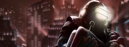
rek wrote:1 looks really really flat. The effects overlapping him in the wrong places kind of kill any possible depth. focal is really weak, too much going on around him. Need to fix up lighting, his face is shadowed, but theres light everywhere. Also colouring, the tone of everything around him doesnt match up with the tone of the render itself.

2.. is your render b/w? You always seem to mix a b/w focal with a coloured everything else. :roll: Again, work on colouring, depth, lighting. Focal isn't strong enough as well.

kiu
Image

Post Reply

Return to “Artists Corner”