Digital art design, renderings, signatures and anything art related. Upload pictures of your newest work or ask for feedback. Post graphics requests or discuss art in general.
*looks up all of snoopys anti-anime posts*... LOLOLOLOLOLOLOLOLOLOLOLOLOLOL
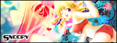
they arent too bad :] ur def improving quickly, lol @ the jump though that pretty big ( ur brush spam trick didnt go that bad lol ). i just think the black floral brush area kills it in a way, and the random red and blue soft brushes do too. oh and easy to notice you just rotated it cuz ur flowish thing u got goin on in the first one went away =o, oh and the text as a base with dull bg colour for the first one isnt the best looking, i'll assume thats why u made the switch?
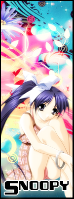
Thanks BrokenSaint. Colouring is usually my biggest difficulty, being colour deficient/blind. I used my glasses this time though, seems to have paid off.
BrokenSaint wrote:Very, nice especially the coloring. You should probably work on the depth and establishing flow.
BTW, I'm an ass man. :p
ewww ass man i hope u know what comes out of the ass tits 4 the win! lol
You really sound like you watched THAT video. Everyone who saw IT says what you just said. You really shouldn't have watched IT, because ass is as important as tits. u.u