Digital art design, renderings, signatures and anything art related. Upload pictures of your newest work or ask for feedback. Post graphics requests or discuss art in general.
I absolutely love both, but I agree that the second one looks stretched out of proportion.
O o /¯____________________________ ______________________________ ___/ | I'M A FIRIN MAH LAZOOR! BLAAAAAAAAAAARGHHH \_¯¯¯¯¯¯¯¯¯¯¯¯¯¯¯¯¯¯¯¯¯¯¯¯¯¯¯¯ ¯¯¯¯¯¯¯¯¯¯¯¯¯¯¯¯¯¯¯¯¯¯¯¯¯¯¯¯¯¯ ¯¯¯\
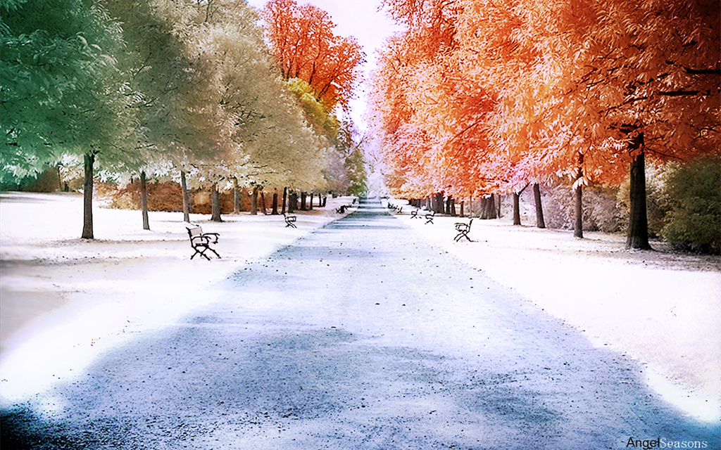
That's really cool how you do that with the colors. Do you make your stocks b/w and then use the "color" blending thing? Or is there a different way to do it?
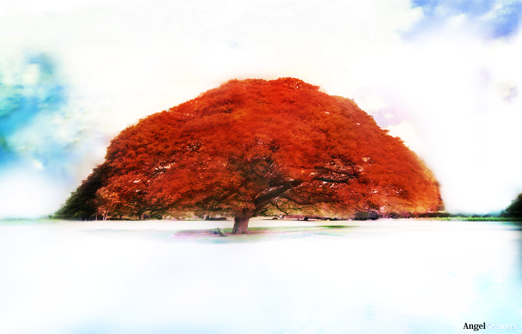
Also, that's the biggest tree I've ever seen. It looks like it would be hella fun to climb or build a hammock in
lavapockets wrote:That's really cool how you do that with the colors. Do you make your stocks b/w and then use the "color" blending thing? Or is there a different way to do it?
Also, that's the biggest tree I've ever seen. It looks like it would be hella fun to climb or build a hammock in
i did for the first but for the last one i didnt had to make it b/w bcuz green is a kinda bright color and i wanted to go for the bright colored tree in the snow but ya usually its best to make it first black and white and depends on the pic wut kind of blending option i put it in normally its "overlay" and playing with the opacity to get the right color. also brighten and burn the original stock so u get brighter and darker spots around some places
im not lazy xD imageshack doesnt allow to upload pics bigger then 1.8gb :S