Digital art design, renderings, signatures and anything art related. Upload pictures of your newest work or ask for feedback. Post graphics requests or discuss art in general.
Verfo's looks like a stock with a quick pentool around it even if he followed the theme not worth the vote in my opinion.
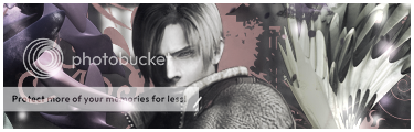
Between Izmiester and Kirk - kirk get's points for taking the theme and molding it into his own favor and not just being a generic yuppie wanna be. Izie, I liked your compo also it's the "puky" green brown colour on your right side that ruined it for me.
After scanning through the sigs for a few minutes I ended up going with Izie simply because, kirk, you have a bad habit of greyscaling your focal surrounded by colour.
Overall everyone put in a good effort, not the easiest of themes I must say.
Hostage wrote:Verfo's looks like a stock with a quick pentool around it even if he followed the theme not worth the vote in my opinion.
Between Izmiester and Kirk - kirk get's points for taking the theme and molding it into his own favor and not just being a generic yuppie wanna be. Izie, I liked your compo also it's the "puky" green brown colour on your right side that ruined it for me.
After scanning through the sigs for a few minutes I ended up going with Izie simply because, kirk, you have a bad habit of greyscaling your focal surrounded by colour.
Overall everyone put in a good effort, not the easiest of themes I must say.
It was supposed to be b&w but i ended up with that. lol
izmeister wrote:The render was supposed to be some dark mage women, the render had 2 demons behind her =/
Ahhh, I see. When you're in a situation like that - play with the "curves" option, it's amazing how well you can change colours and how fluently with curves. Orrr just render the mage out so you don't stuck with extra stuffs you don't need. xD
Kirk wrote:It was supposed to be b&w but i ended up with that. lo
It's all good home fry just remember to add a black/white filter towards the end to make sure it is infact black and white.