NSR riku

Digital art design, renderings, signatures and anything art related. Upload pictures of your newest work or ask for feedback. Post graphics requests or discuss art in general.
Post Reply
User avatar
hemagoku
Addicted Member
Posts: 2720
Joined: Sun Apr 29, 2007 11:42 pm
Quick Reply: Yes
Location: Artist Corner

NSR riku

Post by hemagoku »

Image

now my sigs are same size xD

User avatar
Kirkaldi
Veteran Member
Posts: 3083
Joined: Thu Jul 31, 2008 2:50 am
Quick Reply: Yes
Location: nyc

Re: NSR riku

Post by Kirkaldi »

:shock: 10/10 Perfection.
Image

User avatar
MasterKojito
Ex-Staff
Posts: 1923
Joined: Mon Apr 30, 2007 6:16 am
Quick Reply: Yes
Location: November the 15th

Re: NSR riku

Post by MasterKojito »

Move the text closer to the face, other than that gw. 7.6/10
Image

User avatar
Kirkaldi
Veteran Member
Posts: 3083
Joined: Thu Jul 31, 2008 2:50 am
Quick Reply: Yes
Location: nyc

Re: NSR riku

Post by Kirkaldi »

MasterKojito wrote:Move the text closer to the face, other than that gw. 7.6/10

-_- u nab :banghead:
Image

User avatar
DumboDii
Addicted Member
Posts: 2961
Joined: Sat Sep 13, 2008 7:20 pm
Quick Reply: Yes
Location: Finland

Re: NSR riku

Post by DumboDii »

It's simple and good. His face is little too blurred though. But.... KINGDOM HEARTS FTW!!!! 8.5/10
Drop the beat

User avatar
*BlackFox
Forum Legend
Posts: 7921
Joined: Wed Sep 03, 2008 12:55 pm
Quick Reply: Yes
Location: Off Topic

Re: NSR riku

Post by *BlackFox »

9/10 pretty good
Image

User avatar
Melez
Veteran Member
Posts: 3009
Joined: Thu Jul 10, 2008 10:22 am
Location: лол шта
Contact:

Re: NSR riku

Post by Melez »

I don't really like it tbh.. The c4d placement is ok though..
Image

cin

Re: NSR riku

Post by cin »

Melez wrote:I don't really like it tbh.. The c4d placement is ok though..

meh.

idk. c4d looks so obviously c4d.. and i really don't like
how that c4d is like transparent and shows something behind
the c4d in the right.

i'd go with a 7.5/10.

User avatar
Melez
Veteran Member
Posts: 3009
Joined: Thu Jul 10, 2008 10:22 am
Location: лол шта
Contact:

Re: NSR riku

Post by Melez »

Sorry, didn't really say why. Well, you mentioned it, the c4ds are too.. obvious, normal with lower opacity.. It needs a better composition for now imo, as the BG is empty. imo.
Image

User avatar
IceCrash
Forum Legend
Posts: 6816
Joined: Thu Nov 09, 2006 4:49 pm
Quick Reply: Yes
Location: Anything goes

Re: NSR riku

Post by IceCrash »

i agree with Melez : o
Image

User avatar
Hostage
Veteran Member
Posts: 3119
Joined: Thu Jan 25, 2007 8:34 pm
Quick Reply: Yes
Location: Canada,On

Re: NSR riku

Post by Hostage »

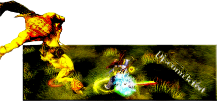
I like this one a lot, done very well.

I would however drop the text, you seem to go overly fancy with your fonts -- not text but font, having a little creativity with text is fine and even encouraged but try not to mix and match a handful of fancy fonts it just looks yucky. Especially not in sigs and while we're at it scrap the "cinema" style border, it's making your sig look thin and since you're already working with a small narrow canvas there's no need for it. Besides, leave borders to bigger works that have a canvas with a need for one. I personally don't see the need for them in sigs anyways especially the cinema style one, put our nooby days behind us shall we? It's 2009 now. :P

Anyways overall great job I would throw a little more green on your left side, something "foresty" since that's the type of scene I imagine going on behind her. Other then that and a bit more post work I'd say you're fine. :)

User avatar
hemagoku
Addicted Member
Posts: 2720
Joined: Sun Apr 29, 2007 11:42 pm
Quick Reply: Yes
Location: Artist Corner

Re: NSR riku

Post by hemagoku »

he is a guy ,u making me doubt myself xD ,but i think he is a he

User avatar
Disconn3cted
Veteran Member
Posts: 3293
Joined: Fri Mar 23, 2007 3:28 pm
Quick Reply: Yes
Location: WV, USA

Re: NSR riku

Post by Disconn3cted »

I like it
Image

Post Reply

Return to “Artists Corner”