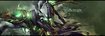
Digital art design, renderings, signatures and anything art related. Upload pictures of your newest work or ask for feedback. Post graphics requests or discuss art in general.
Nice, i really like the bg and the text isnt bad its just kind of hard to see the IR in iron man but it could be worse. I like the colors, i like this version a bit better than the one in your sig. The one in your sig just seems sort of washed out, but thats just my opinion Great job!!
TheMilkman wrote:Nice, i really like the bg and the text isnt bad its just kind of hard to see the IR in iron man but it could be worse. I like the colors, i like this version a bit better than the one in your sig. The one in your sig just seems sort of washed out, but thats just my opinion Great job!!
i agree with this but the one in your sig is much much better! sig version is great! I love the background and the flow, its really amazing
keep the dull version, it looks sssoososososososoo sweet
mmmmmmmmmm yea the new one is HOT <3 I like the colors!!But your blending and smudging was better in the older one me thinks. Perhaps more of a melding of the two? Good job anywho