Digital art design, renderings, signatures and anything art related. Upload pictures of your newest work or ask for feedback. Post graphics requests or discuss art in general.
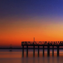
The first is way to over sharpened/exposed/ contrasted. To be honest I don't know what you did but I'm guessing it's one of those if not all three. I would practice your colouring.
Second is best for me aswell, nice soft look and a decent flow. I would have picked the 3rd one if there was a bit of magenta/pink thrown in there. You have an interesting style just keep practicing.
tnx, on first is sharpen,just sharpen,gradient maps and one more rander xD
All of these except one of them have no flow. Might wanna work on that, and work on colouring too. Some sigs are over sharpened. But good work anyways. kiu


