Was Bored

Digital art design, renderings, signatures and anything art related. Upload pictures of your newest work or ask for feedback. Post graphics requests or discuss art in general.
Post Reply
User avatar
Amelie
Veteran Member
Posts: 3669
Joined: Wed Sep 06, 2006 2:41 am
Quick Reply: Yes
Location: Daikanyama

Was Bored

Post by Amelie »

too much coffee, therefore cant sleep.

However i made this, i found it cute.

Image
Image

User avatar
Verfo
Veteran Member
Posts: 3655
Joined: Thu May 01, 2008 12:21 am
Quick Reply: Yes
Location: evol efil

Re: Was Bored

Post by Verfo »

the background is awesome imo, but the render is too small, make it bigger and dont show the whole render just the top part, 8/10, keep up the good work.
<< banned for proof of botting. -cin >>

User avatar
Hostage
Veteran Member
Posts: 3119
Joined: Thu Jan 25, 2007 8:34 pm
Quick Reply: Yes
Location: Canada,On

Re: Was Bored

Post by Hostage »

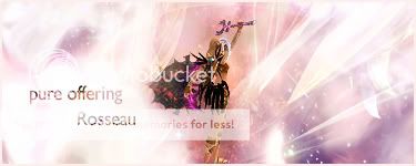
Verfo wrote:the background is awesome imo, but the render is too small, make it bigger and dont show the whole render just the top part, 8/10, keep up the good work.


I would avoid that if I were you it looks fine the way it is, maybe just work on the text a little and blend her in a bit, other then that fantastic work.

My reason being to not change the render is because of the direction she is facing, if you scaled her up and her back is turned to the audience, it would look odd. Besides with her at this size the c4d is working to add great flow. KIU ^^


PS, second glance. Nice lighting.
Last edited by Hostage on Tue Sep 23, 2008 7:08 am, edited 1 time in total.

User avatar
rek
Ex-Staff
Posts: 5607
Joined: Sun Dec 31, 2006 10:46 am
Quick Reply: Yes
Location: darkroot garden
Contact:

Re: Was Bored

Post by rek »

Awesome. Just work on the text. kiu
Image
<3
0len

User avatar
MasterKojito
Ex-Staff
Posts: 1923
Joined: Mon Apr 30, 2007 6:16 am
Quick Reply: Yes
Location: November the 15th

Re: Was Bored

Post by MasterKojito »

Don't listen to rek, the text is great :wink: . Great work, 7/10 :)
Image

User avatar
Melez
Veteran Member
Posts: 3009
Joined: Thu Jul 10, 2008 10:22 am
Location: лол шта
Contact:

Re: Was Bored

Post by Melez »

Nice, but get the render bigger. And a bit better blend would be good, too. KIU :love:
Image

User avatar
Amelie
Veteran Member
Posts: 3669
Joined: Wed Sep 06, 2006 2:41 am
Quick Reply: Yes
Location: Daikanyama

Re: Was Bored

Post by Amelie »

thx for your replies guys :love:
Image

cin

Re: Was Bored

Post by cin »

i like it a lot amelie.

only 2 things; i think it would be better if some of the
"smoke", or whatever i can call your background effects,
would go in front of the render. this might add up to the
depth of the sig.

second is that i like the text already, but i think it
could look even better if you would have less space in
the vertical direction. so basically putting "pure off-
ering" and "Rosseau" closer to eachother.

other than that, great job ame :love:

User avatar
Amelie
Veteran Member
Posts: 3669
Joined: Wed Sep 06, 2006 2:41 am
Quick Reply: Yes
Location: Daikanyama

Re: Was Bored

Post by Amelie »

ty baby :love: , i'll try to work on that when i get back in my place.
Image

User avatar
IceCrash
Forum Legend
Posts: 6816
Joined: Thu Nov 09, 2006 4:49 pm
Quick Reply: Yes
Location: Anything goes

Re: Was Bored

Post by IceCrash »

cin wrote:i like it a lot amelie.

only 2 things; i think it would be better if some of the
"smoke", or whatever i can call your background effects,
would go in front of the render. this might add up to the
depth of the sig.

second is that i like the text already, but i think it
could look even better if you would have less space in
the vertical direction. so basically putting "pure off-
ering" and "Rosseau" closer to eachother.

other than that, great job ame :love:

agreed

really like the sig amelie KIU
Image

Post Reply

Return to “Artists Corner”